Categories
Weekly Lessons

Week 7: Walk Cycles

Import and Rig Your Character

Now that you (hopefully) have your main character designed and created, you should be ready to import it into After Effects and get it rigged and ready for animation.  Remember that you can continue to tweak your character as you go by opening the Illustrator or Photoshop file and making adjustments.  However, making major changes that alter the overall shape of your character or modify the layer structure will cause problems for the imported file.  In other words, don’t import your puppet until you are generally happy with their design and layout.

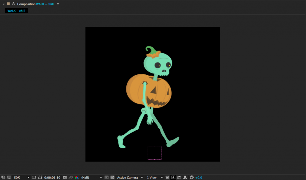
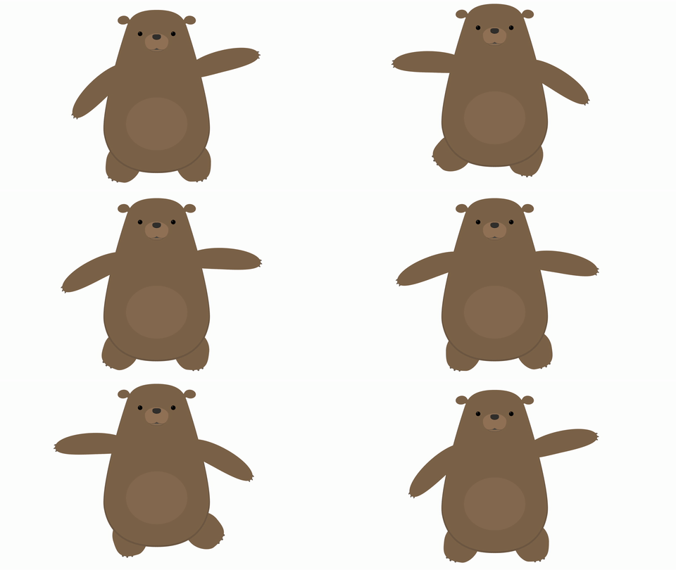
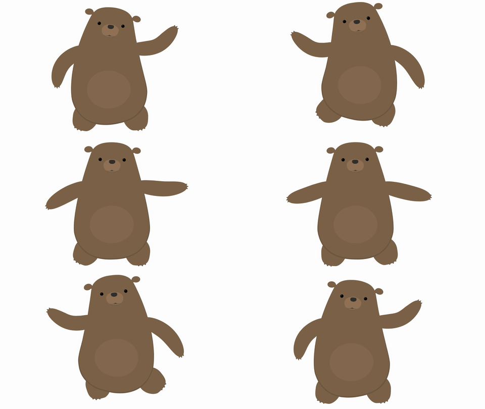
You can download a puppet that I created at this link.  You’ll notice that the character was drawn in a sort of “three-quarter” view – he is distinctly facing one direction, but you can still see a lot of the character’s front.  I find this to be the most versatile default pose for characters; you can move their eyes and features a bit and get most of the benefits of a straight-on frontal pose, but still animate them walking and moving across the screen.  For something like the “classic” walk cycle we’ll be tackling today, you’ll need to use a puppet that is facing left or right – either a side or three-quarter view.  Depending on your individual needs, you may need to draw your puppet several times from different angles.

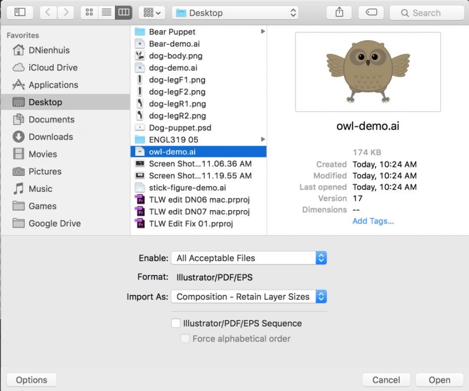
If you’ve created your character in Photoshop or Illustrator, remember that you need to change the import settings when you bring in your file.  Under “Import As:” select “Composition – Retain Layer Sizes.”  Also make sure that the “Sequence” setting (below “Import As:”) is not checked.  If you have everything set up correctly, your file will be imported as a new composition with the different layers separated.
We’ve already covered the basics of setting anchor points and parenting for puppets, but let’s quickly review the process.  First, use the Pan Behind tool (Y) to move the anchor points to their appropriate locations.  If you have a simple puppet, you might just have layers for the arms, legs, body, and head.  If you have a more complex puppet, you might have layers for the individual fingers, hands, forearms, upper arms, upper and lower legs, feet, toes, torso, hips, neck, head, facial features, articles of clothing, and more.  In either case, remember that the anchor points should be placed at the point around which you want the layer to rotate.  The hands rotate at the wrist, the forearms rotate around the elbow, the upper arms rotate at the shoulder, and so on.  If you have separate layers for the  torso and hips, set their anchor points near the waist of your character.

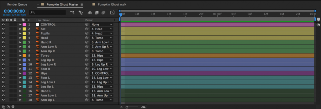
Once everything has its anchor point placed appropriately, it’s time to parent the layers.  Fingers are parented to the hand, hands are parented to forearms, forearms are parented to upper arms, upper arms are parented to the torso, etc.  If you have separate torso and hips layers, parent the torso to the hips.  This will allow your character to bend at the waist.  This will most likely make your hips layer the top parent layer – the “root” layer that everything is ultimately connected to.  If this is the case, you may want to create a null object (Layer>New>Null Object) to parent the hips to.  This will act as a sort of “master control” layer.  If you have any layers that are difficult to select because they are small or covered by other layers, you can create additional null objects and parent those layers to them.  I often find it helpful to create a null object to control the eyes of a puppet.

As you parent the layers to each other, test them out by rotating them with the rotate tool (W).  If something looks wrong, check the location of the anchor point, the overall position of the layer, and the parenting order.
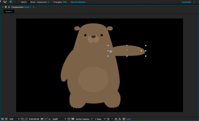
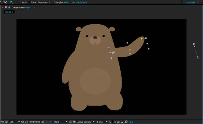
If you planning on animating your character using the puppet pins tool, use it to place deformation pins on the layers of your puppet.  The more pins you add, the less each one does, so for very exaggerated elastic movement, only use a few pins – three is a good bet for the “rubber hose” effect on arms and legs.  If this is the style of animation you want, place a pin at the shoulder, elbow, and wrist.  Adding more pins will create subtler deformation and if you want to limit the influence of a certain pin, you can place additional pins in the areas you want to hold down.

When you have everything anchored, parented, and pinned, take a moment to ensure that your layers are named appropriately.  You may also want to color code the various layers by clicking on the small colored square next to the layer name in the timeline panel.  Use whatever system makes sense to you – you could make the left leg and left arm layers the same color, for example, or you could give everything a unique color.  I like to make whatever the “top” or “master” layer happens to be a nice bright color so that I can find and select it quickly.

Once your puppet is rigged and organized, do not start animating directly within the composition you have imported.  Instead, name the layer something like “Character Rig Master” and keep it as a reference.  You can duplicate the composition or copy and paste the layers within it into other compositions to actually do your animation.  Getting your puppet correctly rigged takes time and you don’t want to have to do it more than once.  Since you will probably be using several copies of your puppet throughout your project, it makes sense to keep one composition as a reference that you can copy from.

Creating A Walk Cycle

Now it’s time to tackle one of the most challenging things in character animation – walking.  Walking is one of those actions that’s both ubiquitous and surprisingly complicated.  When a walk looks wrong, it sticks out noticeably – good walk cycles appear effortless.  The way a character walks also tells the audience a lot about their personality, mood, age, and more.  It’s an important skill for any character animator to work on.  Mastering it takes a lot of practice.

We’ll be creating a walk cycle that can be looped in After Effects.  Because it loops, we only need to animate a short section – probably between 12 and 24 frames – but a lot needs to happen in that time and the cycle needs to end exactly where it begins.  This is what allows the animation to be played over and over seamlessly.

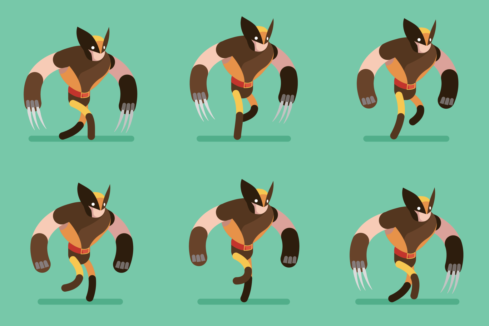
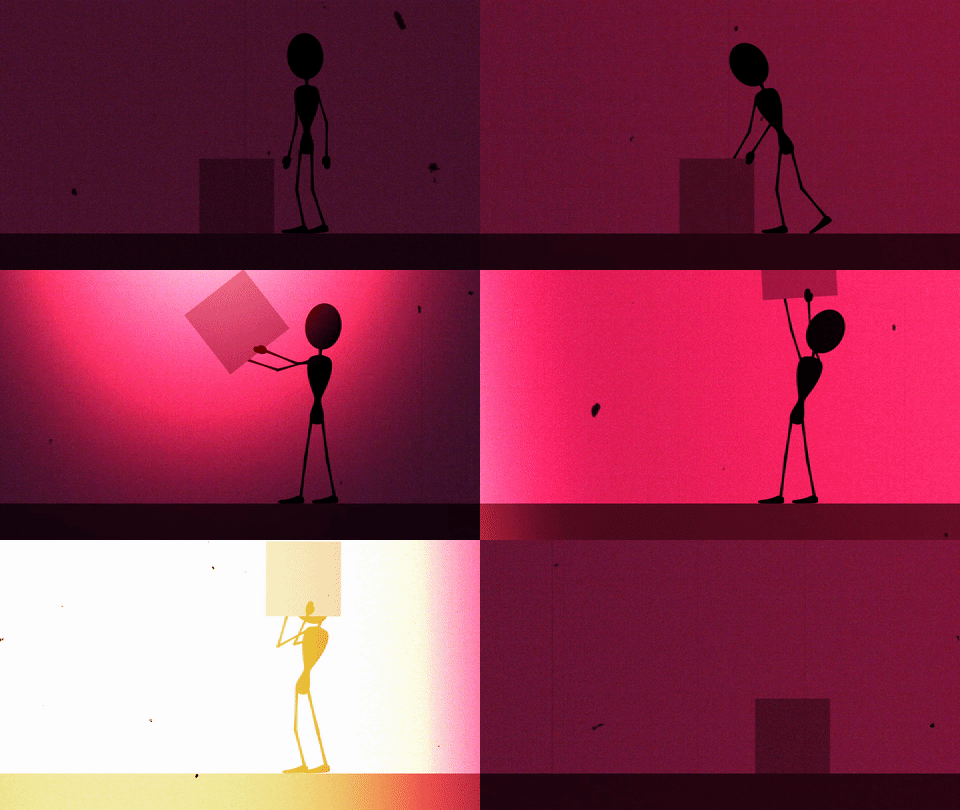
Animator Alan Becker, whom you may remember from his animated explanations of the twelve basic principles of animation, breaks walk cycles down into four key poses.  The two most important poses are “contact” and “passing.”  During the contact post, one foot is extended forward and just touching the ground.  During passing, that leg goes back and the opposite leg passes it, moving forward.  The cycle then repeats with the opposite legs contacting and passing.  The other two poses are “down” and “up”, which deal with the position of the head.  The head is at its lowest point after contact and its highest point after passing.  The arms generally swing opposite the legs, so the left arm is forward when the right leg is making contact.  However, there is a fair amount of flexibility in how the arms can be animated – for example, they can hang forward listlessly to make the character seem downtrodden.
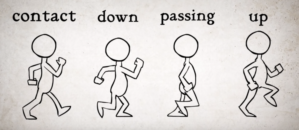
Here’s an even quicker summary: a walk cycle starts with one foot – say, the right foot – extended forward with the heel just hitting the ground.  At this point, the left foot is back, pushing the figure ahead.  As the legs move and those positions are reversed, the head lowers, returns to the middle point, raises, and returns to the middle point again.  This action then happens again, returning the figure to the original position and completing the cycle.
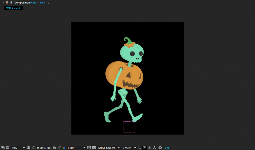
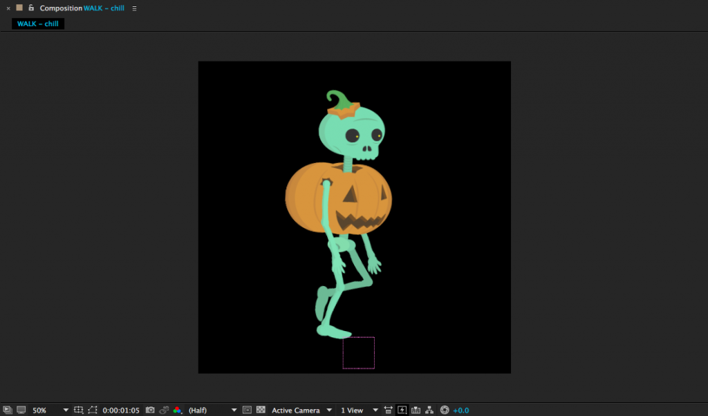
Contact:  Right leg forward, heel just hitting the ground.  Left leg back, toe about to lift.
Passing:  Right leg center, planted. Left leg bent and lifting forward, passing the right.
Contact:  Right leg back, toe about to lift. Left leg forward, heel just hitting ground.

To see walk cycle animation in action, let’s return to the talented and snarky Ross Plaskow.  Plaskow animates using puppet pins, but you should be able to adapt his technique to characters that are animated only using rotation and position keyframes.  Plaskow’s walk cycle takes only 16 frames to complete and loops seamlessly.  If you would like to download the bear puppet that he uses in the tutorial, you can find a slightly simplified version of it here.  Otherwise, feel free to use your own puppet or one of mine.

Here are a few tips, if you find yourself feeling frustrated:

  • Follow Plaskow’s example and rearrange your panels.  It’s very helpful to be able to see all the layers in the timeline at once.  You can easily switch back to a standard view when you finish the walk cycle.
  • Start with the legs and animate one leg at a time.  Don’t try to keyframe everything simultaneously.
  • Don’t neglect the “passing” pose – it’s important.  If you skip the passing pose, the legs will sort of “sweep” instead of lifting naturally from one step to another.
  • Subtle movements carry a lot of weight.  It’s easy to overdo things like rotation and the up and down movement of the head.
  • Consider animating the arms last – their movement can completely transform the “feel” of the walk cycle.
  • Try working on a slow walk cycle – a full second or two, for example – and then shrink all your keyframes closer together to speed it up.  It’s sometimes easier to work with more space on the timeline, but fast walk cycles generally look better.
  • Make sure that your puppet is in exactly the same position at the beginning and end of the walk cycle.
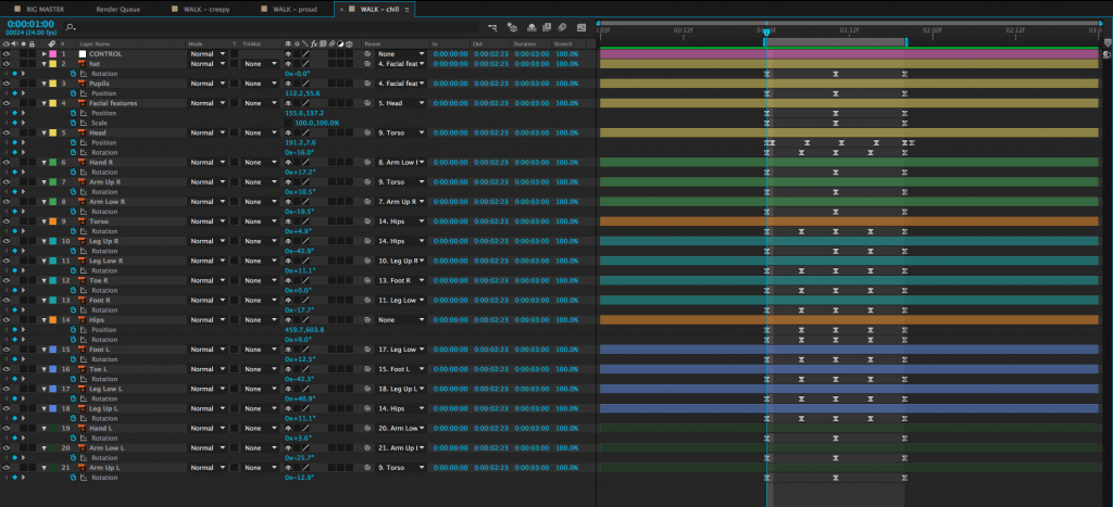
  • Use the work area handles in the timeline to define the length of your walk cycle.  You can preview only the work area (on a loop) using the controls in the Preview panel.  The 0 (zero) key on the number pad is the keyboard shortcut for this.
  • Try creating a “floor” using a solid as a point of reference – it can help you visualize where the feet should be hitting.  When you are finished, you can delete or hide the layer.
  • Walk cycles look more believable with lots of overlapping movement.  Adding small amounts of animation to the rotation of the torso, the position of the head, the sway of the hands, etc. help sell the overall effect.
  • Walk cycles usually look terrible until you are about 80% done with the process of animating them.  Keep plugging away.
  • This kind of animation is notoriously challenging – don’t feel frustrated if you don’t get it correct right away.

Making a Loop

A walk cycle is just that – a cycle.  That means that it can be looped over and over as much as needed.  As long as the first frame of the cycle and the last frame of the cycle are identical, the loop should be seamless.  You can loop animation in a few different ways.  You could, for example, copy and paste the keyframes over and over again.  You could also bring the entire walk cycle composition into another comp and duplicate it.  However, there is a much more efficient way of looping animations in After Effects – as long as you’re willing to utilize expressions.

Expressions are pieces of code that can be used to automate various animations within After Effects.  They are incredibly powerful – and can become incredibly complicated.  For the time being, all you need to know is that expressions can be turned on for any keyframe-able property in the timeline panel by alt-clicking on the stopwatch icon next to the name of that property.  This will bring up a text box in the timeline, which the expression can be typed into.  To remove an expression from a property and return to normal, alt-click on the stopwatch icon again.

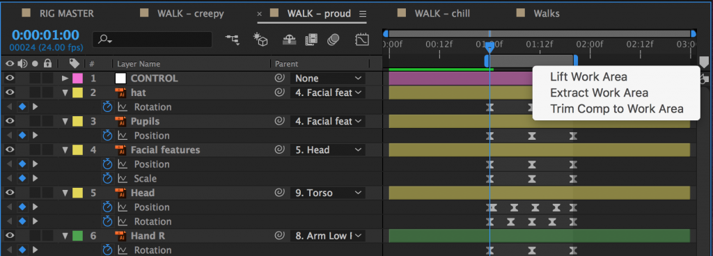
The first step in creating a looping walk is to isolate the walk cycle itself.  In your walk cycle comp, position your work area handles around the walk cycle, if they aren’t already.  Right-click on the lighter grey area between the handles and choose “Trim Comp to Work Area.”  The composition will shrink down to only the area in the work area, which will probably be less than a second for a walk cycle.
To create a loop of the walk cycle, you’ll need to be working in a different composition.  So create a new one (longer than the walk cycle composition) and drag the walk cycle comp into it.  Right-click on the walk cycle comp in the timeline and go to Time>Enable Time Remapping.  Click it.

A new property called “Time Remap” should appear under the layer name.  You should also see a keyframe appear at the beginning and end of the composition.  Time Remapping is actually a very powerful property in After Effects – it allows us to speed up or slow down footage, or freeze it completely.  It also allows us to create an animation loop using an expression.

The expression we’ll be using loops all of the keyframes for a given property.  We’ll be looping the Time Remap property to create an endless walk cycle.  However, because of the way that After Effects creates compositions, the last keyframe in a time-remapped composition is actually blank – if you go to the last frame of your walk cycle comp in the timeline, you’ll probably see a blank screen.  So, go to the last frame, then go back a frame and press the “create keyframe” button in the timeline (it looks like a blank keyframe and can be found to the left of the layer name in the timeline).  Then delete the keyframe at the very end of the comp.

With keyframes at the beginning and end of the walk cycle animation, it’s time to add the expression.  We’re going to be adding this expression to the Time Remap property, so alt-click on the stopwatch icon next to “Time Remap.”  The expression text window should appear in the timeline, along with the expression controls.

On the left of the timeline, you should see a series of icons next to the words “Expression: Time Remap.”  One looks like an equals sign, one looks like a graph, one is the pick whip, and the last one looks like a little “play” symbol – an arrow in a circle.  Clicking on this last one brings up a menu with different expressions that can be inserted.  Go to Property and select loopOut(type = “cycle”, numKeyframes = 0).  It’s about halfway down the list. Click on it and it should be added to the expression in the timeline.  Click out of the text window or hit “enter” on the keyboard to exit the text editing mode.

Any keyframes for that property – and there should only be two, one at the beginning and one at the end – should now loop for the length of the layer.  Click and drag the end of the layer to make it longer.  If you preview the composition, you should see the walk cycle animation looping and the character walking continuously.

Here’s a quick recap of the steps:

  1. Trim the walk cycle comp to the exact length of the cycle.
  2. Drag the trimmed walk cycle comp into a different composition.
  3. Right-click on the walk cycle comp in the new comp and select Time>Enable Time Remapping.
  4. If the last keyframe in the layer is blank, create a keyframe at the last frame of actual walk cycle animation and delete the blank one.
  5. Alt-click on the Time Remap keyframe icon to create an expression.
  6. From the expressions menu, select Property>loopOut(type = “cycle”, numKeyframes = 0).  Hit “enter” or click out of the text area.
  7. Extend the walk cycle comp as long as you like.

That may seem like a lot of steps, but it goes quite quickly once you are used to the process.  Once you have the expression set up correctly, you can copy the looping walk cycle from one layer to another easily – and make the walk cycle as long as you want.  The loop out expression works with other properties as well, so feel free to experiment; if things start to look strange, you can always remove the expression by alt-clicking on the stopwatch icon.

Project 7: Mid-Semester Project Animatic

The middle of the semester is nearly upon us, so it’s time to think about the midterm project.  Your project for this class will be to create a short animation, between 15 and 30 seconds in length, utilizing the character that you’ve been working on, and incorporating the theme of “unexpected consequences.”  You can read the full details here.

The finished project isn’t due until the end of spring break – March 21.  For next week, however, I’d like you to create something that you can show the class and receive feedback on.  Draw some storyboards and import them into an After Effects project.  Create compositions for each of the shots in the project, estimating their length as best you can.  Position the appropriate piece of the storyboard into each comp.

Collect these “shot” compositions into a master composition.  You can use this to preview the way your project is fitting together.  See how things flow and adjust the length of the individual shots accordingly.  You can even add some music or sound effects to the master composition to get the full effect.

A video storyboard like this is referred to as an “animatic” or “story reel.”  It’s an incredibly valuable tool for seeing how your project is working as a whole – and for spotting problem areas.  If you’d like, you can even drop your rigged character into the shot compositions and do some rough animation.  However far you choose to go, you should at least have something that shows the flow of your project in real time.  Render it off as a QuickTime movie using the H.264 codec.  Upload it to your Google Drive and send it to me before class next Wednesday.  Next week, we’ll be reviewing these together and providing feedback.

Categories
Weekly Lessons

Quick Review: Exporting Work

Exporting

The process of turning your After Effects composition into a finished video can be a little confusing.  Let’s quickly review the process.

Your first step should be trimming the timeline so that only the section you want will be exported.  When you create a new composition, you are asked to define its length, but if you need to change its length, you can do so by going  to  Composition>Composition Settings… or using the Cmd+K keyboard shortcut.  Changing the duration in the composition settings window that appears will either add or subtract time from the end of the composition.  However, you can also trim the composition down from within the timeline panel.

At the beginning and end of the timeline, you’ll find blue handles – these define the “work area.”  (There are actually two sets of blue handles – the smaller ones can be used to zoom the view of the timeline in and out.)  You can think of the work area handles as After Effects’ equivalent of an in and out point.  If you drag the work area handles to the section of the timeline you want to keep, then right-click on the lighter area directly between them, you’ll see a few options appear.  Select “Trim Comp to Work Area” to remove everything outside the handles and shorten the length of the composition.  However, even if you don’t want to trim the comp down, you should use the blue handles to choose the area you want to export.

Once you have your work area defined, you should export your composition using the Render Queue.  The Render Queue exists as a panel in After Effects – it may show up as a tab next to the compositions in the timeline (otherwise, you can always find it under the Window dropdown at the top of the screen).

To add a composition to the Render Queue, open the composition in the timeline, then go to Composition>Add to Render Queue.  The name of the composition should then appear in the Render Queue panel.  Before you hit the “Render” button, you’ll need to set a few parameters.  Unless something has been changed, everything in the Render Settings section should be fine at the default values.  The Output Module is where you actually make changes to the file type and codec, so click on that to bring up a window with lots of options.  For our purposes, just click on “Format Options…” and change the video codec to H.264.  Click OK to close each window.  Finally, set the file’s destination by clicking on the text next to “Output To:”.

So, to recap: start by defining the work area you want to export in your composition, then go to Composition>Add to Render Queue from the top menu, click on the word “Lossless” next to “Output Module”, choose QuickTime as the format, click “Format Options…” and choose H.264.  Click “OK” on the two open windows to get back to the Render Queue, click on the blue text (it may say “Not yet specified”) next to “Output To” and choose the destination and name of the file.  Click the blue “Render” button in the corner, and your video will be created.

Categories
Weekly Lessons

Week 6: Character Design and Creation

Creating Characters

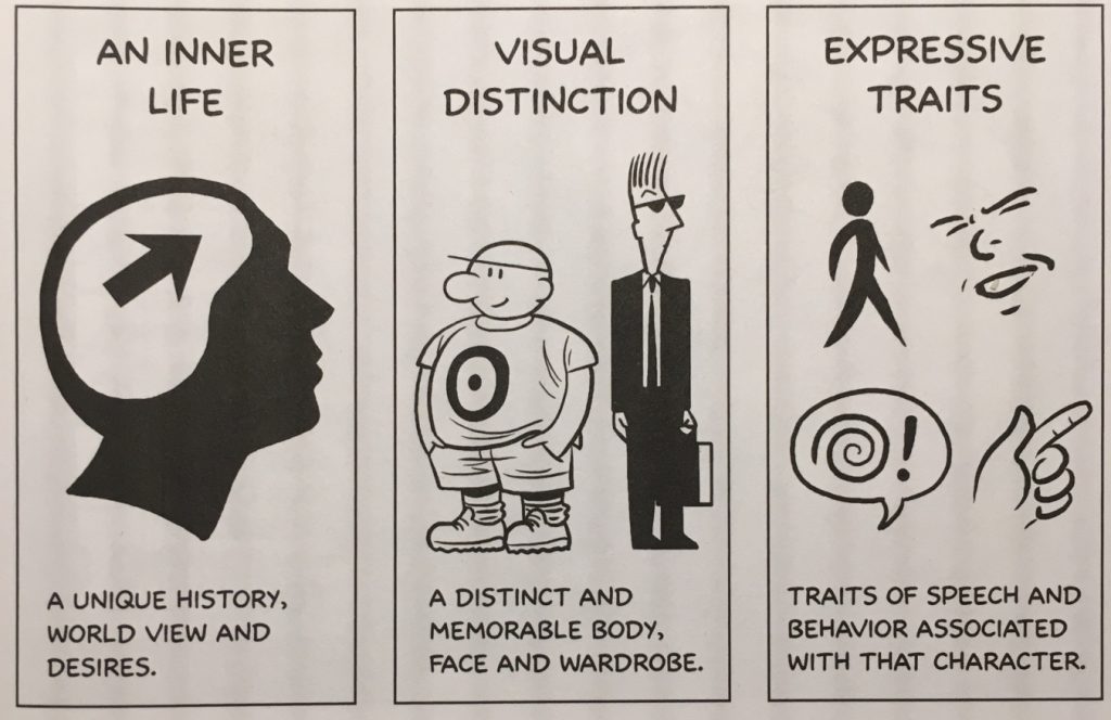
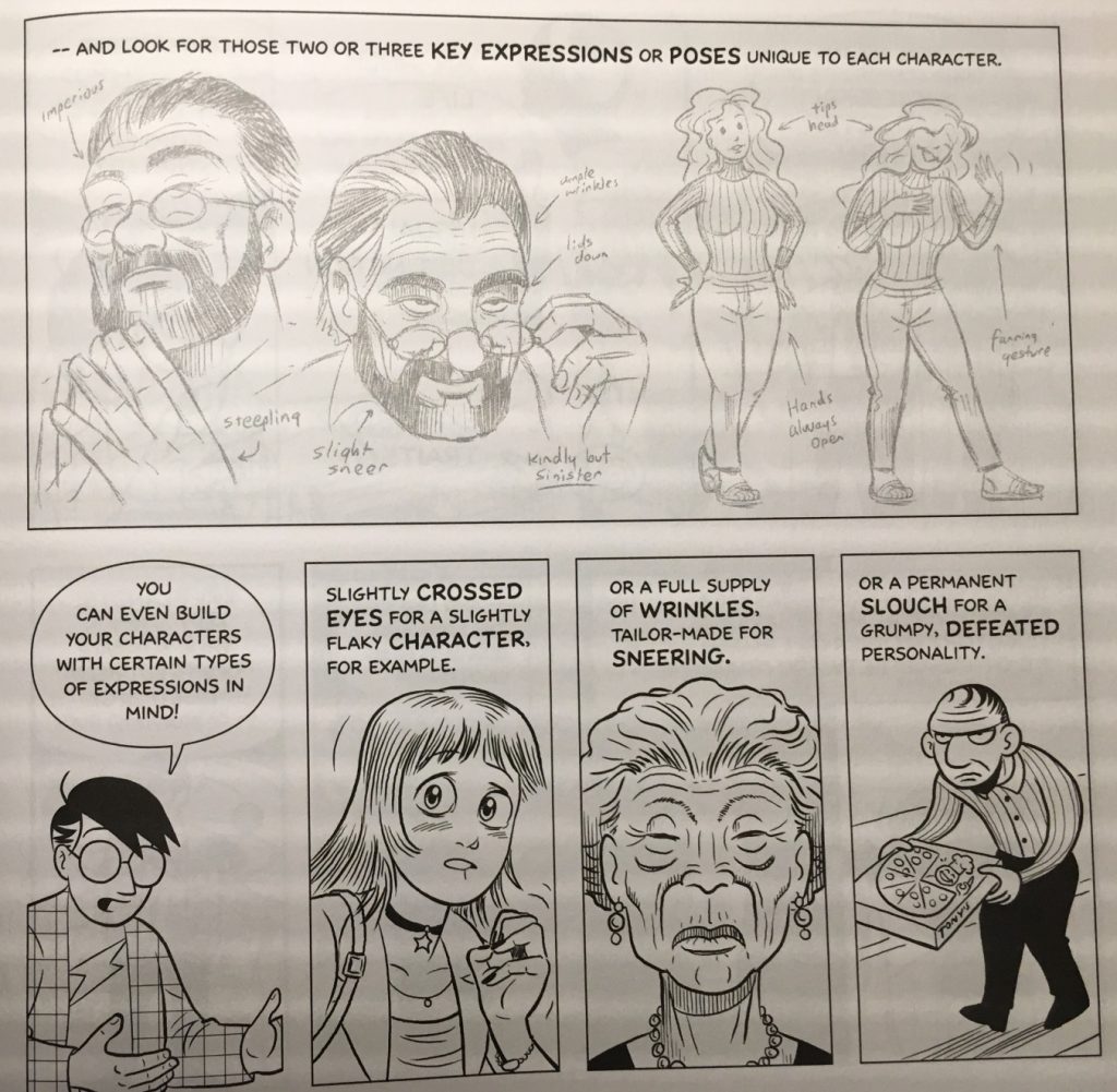
There isn’t really a right or wrong way to design a character; the kinds of characters you choose to make is ultimately a matter of artistic preference.  We can, however, learn a lot by listening to the advice of other artists and animators.  In his book Making Comics, Scott McCloud suggests that there are three qualities that a successful character must possess: an inner life, visual distinction, and expressive traits.  Without these qualities, a character might be confusing, flat, or – worst of all – forgettable.

A character’s inner life relates to their “unique history, worldview and desires.”  This includes a character’s backstory, personality, archetype, and more.  Visual distinction means that a character has” a distinct and memorable body, face, and wardrobe.”  This has to do with a character’s physical characteristics.  Expressive traits are “traits of speech and behavior associated with that character.”  A character’s expressive traits are what make them move and speak in a unique and interesting way – this could include posture, body language, facial expressions, and more.

Backstory

In order to be successful, even a very simple character should have a backstory.  While you certainly don’t need to know every detail of a character’s life history – McCloud writes that “obsessing too much over such details is a classic beginner’s mistake” – you should certainly have a sense of a character’s personal identity.

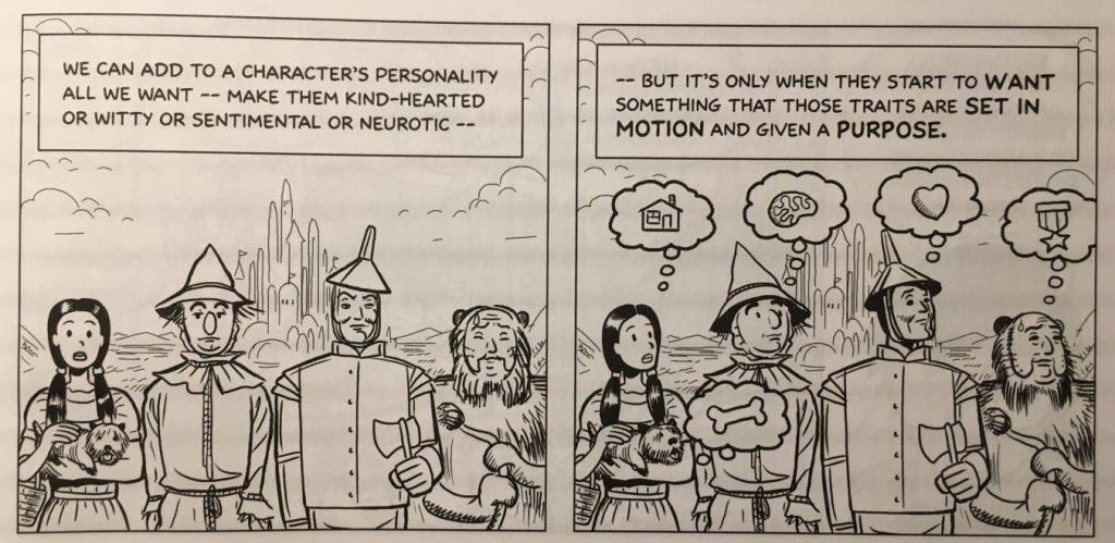
Some characters are defined by specific moments in their history.  Superhero stories often utilize moments like this – think about the origin stories of Spiderman and Batman.  Other characters are defined by their desires – something that motivates them and causes narrative conflict.  Every character in The Wizard of Oz has a clear desire that motivates their actions.  Still other characters fit into certain archetypes.  Star Wars makes great use of archetypal characters: the naive hero beginning a quest, the lovable rogue, the princess, the wise old man, etc.  Your characters can be defined by their history, their desires, their archetype, or some combination thereof – the important thing is that you know and understand them.

Shape and Silhouette

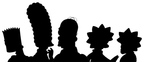
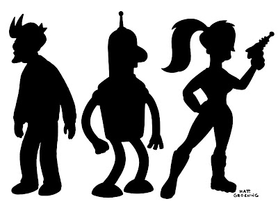
Matt Groening, the creator of The Simpsons and Futurama has a theory of good character design that has helped him create some of the most iconic characters in the history of animation.  “The secret of designing cartoon characters — and I’m giving away this secret now to all of you out there — is: you make a character that you can tell who it is in silhouette. I learned this from watching Mickey Mouse as a kid. You can tell Mickey Mouse from a mile away…those two big ears. Same thing with Popeye, same thing with Batman. And so, if you look at the Simpsons, they’re all identifiable in silhouette. Bart with the picket fence hair, Marge with the beehive, and Homer with the two little hairs, and all the rest. So…I think about hair quite a lot.”

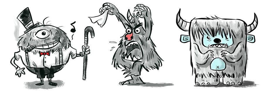
One way to give a character a distinctive silhouette is by using basic shapes as a starting point.  By using a square, circle, or triangle as a starting point, you can give your character a unique look that is easily recognizable.  Of course, you can – and should – elaborate on these basic shapes, but they can be a great starting point.

Shapes can also tell the audience a great deal about a character’s personality.  Think about Ellie and Carl in the Pixar film Up – everything about Carl is square and blocky, which makes him seem gruff and serious.  Ellie is made up of curved lines and circles, so she seems free-spirited and whimsical by comparison.

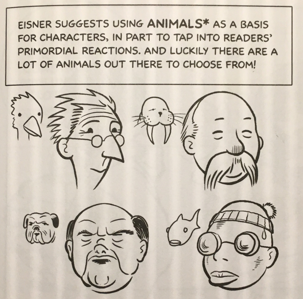
I’d also suggest using lots of reference images when you’re designing your characters.  Don’t feel like you can only draw from your own imagination –there is absolutely nothing wrong with using other images, or even other artists’ characters, as a point of inspiration. Just be sure that you make the finished character your own.

Body Language and Speech

Does your character slouch or stand up straight?  Do they fidget?  Walk with a limp?  Speak with an accent or use particular idioms?  These are some of what McCloud calls “expressive traits.”  Whereas visual distinction has to do with physical appearance, expressive traits are related to what your character does.

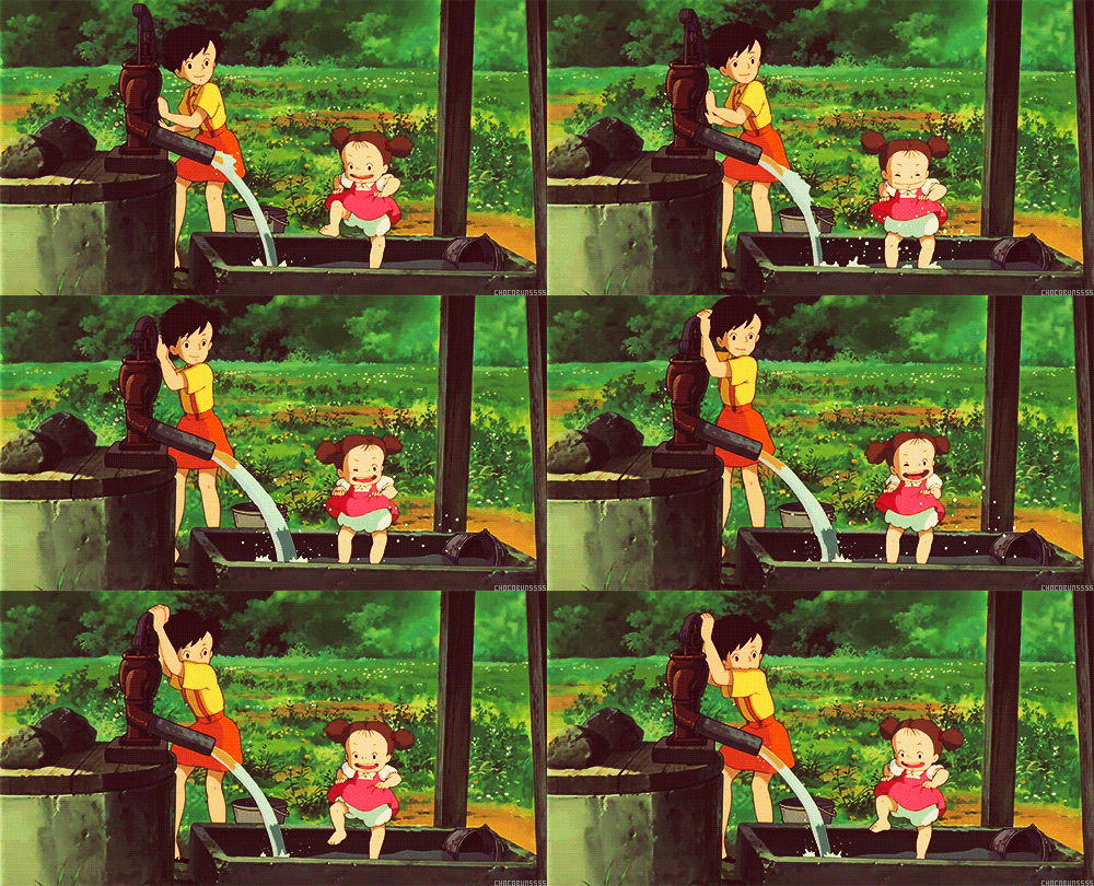
Japanese animation legend Hayao Miyazaki does a masterful job of using physicality to reveal aspects of a character to the audience.  In My Neighbor Totoro, older sister Satsuki is graceful and precise while younger sister Mei is comparatively clumsy.  The way each character moves tells the audience about their age, personality, and relationship to each other.  Satsuki flits across the screen while Mei crashes after her.

McCloud suggests defining key poses or facial expressions for your characters.  These are physical cues unique to each character.  It could be the way someone cocks their head to the side, or leans against a doorframe, or looks over the tops of their glasses.  As the audience gets to know your character, these key actions will become associated with their respective characters and help make them seem more rounded and alive.

You can also use expressive traits to play against a character’s physical appearance.  A hulking, brutish looking character could tiptoe fearfully or a meek-looking character could pose heroically.  There are endless options.

Designing for Animation

We’re not going to dive too deeply into how to use programs like Photoshop and Illustrator, but there are some things to keep in mind.  First, remember the abilities and limitations of After Effects when you are creating your character.  We’ll be animating using keyframed transform properties like rotation and position as well as puppet pin deformation.  This gives us a lot of flexibility, but it also means that some things are more difficult to animate than others.  Wild, elaborate hair, for example and flowing fabric will be challenging to animate in After Effects.  That said, you can often find creative solutions to such problems, so don’t sacrifice your vision.

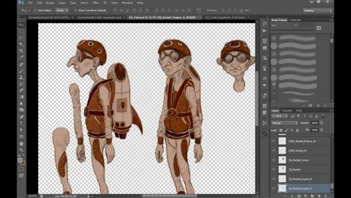
Second, remember to think in layers.  When a Photoshop or Illustrator file is imported, we can retain the layer structure.  If you want something to move independently, put it on its own layer.  As a very general guideline, a good layer breakdown might include the head, facial features, torso, hips, upper and lower arms, hands, upper and lower legs, and feet.  The more elaborate and detailed your character is, the more layers you’ll have to create (and eventually animate).

Finally, think about how your character is going to appear in the animation you will eventually be creating.  If your character is only ever going to appear from the front, you might only need a frontal view – but if your character is going to be seen from the side, behind, or above, you’ll need to create those views as well.  Also think about how closely you’ll be seeing your character on screen.  While Illustrator files can be scaled up without distorting, Photoshop files will pixelate if you zoom in too far.  If you’re creating your character in Photoshop, make them big enough to be usable, or create multiple versions at different resolutions.

Drawing Inside After Effects

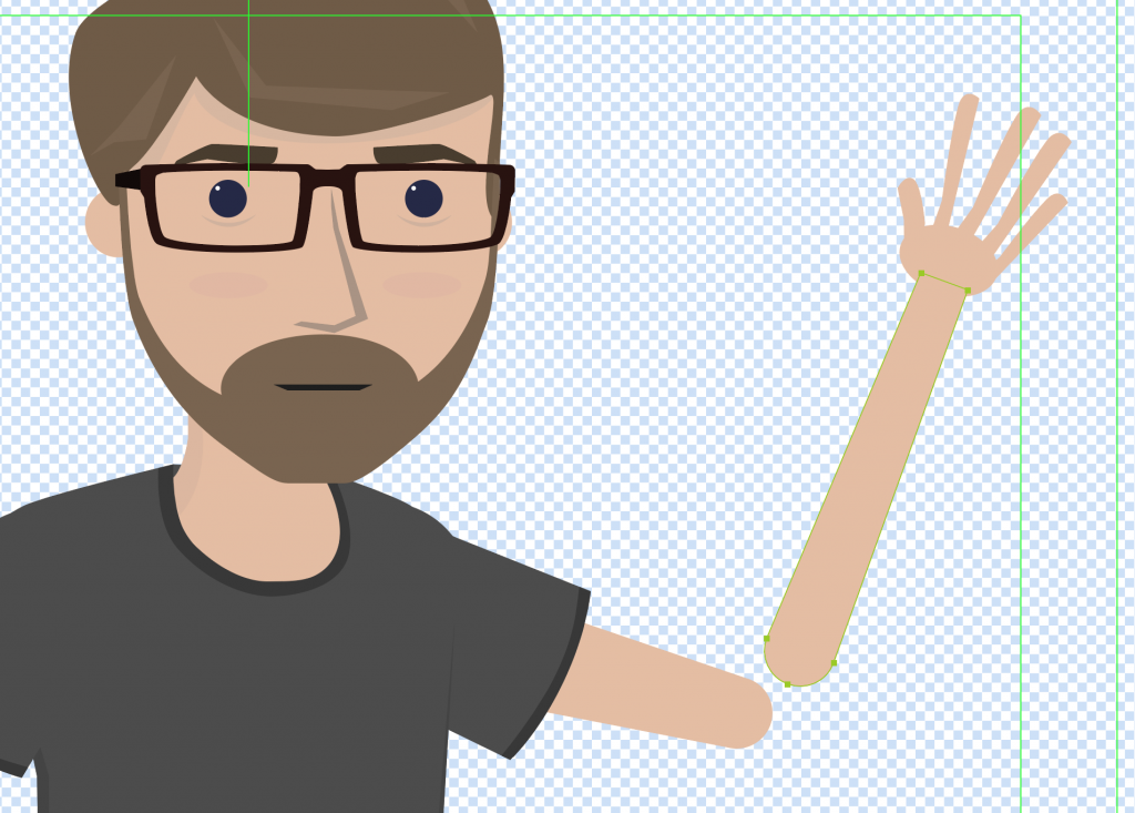
After Effects does not have the same breadth of drawing tools that dedicated programs like Photoshop, Sketchbook, Gimp, or Illustrator do.  However, its tools are robust enough to be used in certain situations and animation styles.  After Effects’ shape tools allow you to control the path, fill, and stroke of shapes, so it’s fairly easy to create relatively simple characters directly within the program.

There are some distinct benefits to building your puppet within After Effects.  For one, since shapes in After Effects are vector-based, they can be scaled up infinitely with no loss in quality.  Creating your puppet within After Effects also means that you have one less file to keep track of and you don’t need to “round-trip” between After Effects and another program to make changes.  Finally, creating a puppet within After Effects lets you keyframe and control aspects of the character in unique ways; for example, you could keyframe the path of a shape or the thickness of its stroke.  That kind of direct control is only possible when creating characters directly within After Effects.

The biggest downside to drawing your puppet within After Effects is that you just don’t have as many options at your disposal.  After Effects is not really a drawing program, so its interface and toolset aren’t designed around that purpose.  That being said, there is still a lot of latitude within the program and you shouldn’t discount it as a possibility.

If you want to use this method, I’d suggest starting with a sketch and then importing it into After Effects.  You can then use the pen and shape tools to trace the sketch in After Effects.  Note that you can actually have multiple shapes – with different fills, strokes, and paths – on the same shape layer, which can help keep your composition a bit more manageable.  However, every part of your puppet that needs to move independently should be on its own layer.

Talented (and profane) animator Ross Plaskow utilizes this method in some of his animation tutorials.

https://youtu.be/fXL9bVnX8fU

Using Photoshop

Photoshop’s biggest asset is probably its ability to modify and utilize other images.  Images can be distorted, manipulated, and combined in very interesting ways.  Photoshop also has very advanced drawing tools – if you are an artist with a traditional drawing background, using Photoshop and a pen tablet may be an easy transition for you.

Photoshop is very well suited for creating characters with texture, shading, and rough edges.  If you want your character to have a hand-drawn look, Photoshop is probably your best choice.  It’s also a great tool for collaging or importing your own artwork.  If you aren’t comfortable drawing digitally, one option is to draw your character by hand, scan it, then separate the layers in Photoshop.

Layers are one thing you’ll need to be mindful of regardless of the method you choose to make your character.  Think about how you want your character to move and let that dictate the structure of your character.  If your character has a long flowing scarf, for instance, that scarf should probably be on its own layer.  Other objects that don’t need to move independently (such as the buttons on a character’s jacket) can be combined with other layers.

Another thing you’ll need to consider regardless of your method is the way that layers overlap and interact with each other.  In Plaskow’s tutorial above, he mentions that overlapping body parts should have curved ends.  This allows two layers – for example, the upper and lower arm, which meet at the elbow – to rotate around each other without creating strange blocky shapes.  Of course, if you plan on animating parts of your character using puppet pins, they will be set up differently.  As mentioned in the previous lesson, keep the way your character is supposed to move in mind as you draw them out.

One thing you’ll want to be sure of when drawing in Photoshop is that the background behind your character is transparent.  By default, Photoshop makes a white base layer, so you may need to delete this.

One nice feature about Photoshop and Illustrator files is that you can turn off the visibility for layers.  The layer will still be there when you import the file into After Effects and you can re-enable its visibility.  So, if you want to draw multiple mouths or eyes for your character, you can make them in the same Photoshop file and simply hide the layers.

Another nice feature of working in Adobe software is that you can continue to update your file even after it’s imported into After Effects.  You need to be careful not to change the overall file structure, but you can continue to make alterations right up until you render your finished video.

Overall, Photoshop is a great tool for puppet creation.  The major downside is that the files you create will eventually become pixelated and distorted as you zoom in on them.  If you keep this limitation in mind, you can use it to make almost anything.

Using Illustrator

While Illustrator and Photoshop have similar toolsets and interfaces, they “feel” different in practice.  You can import still images into Illustrator, just like in Photoshop, but the program is really designed around drawing with curves.  You can create gradients and patterns, but you won’t get the same textural results that you do in Photoshop.  Characters created in Illustrator tend to have clean lines, uniform colors, and be composed of relatively simple shapes.

When working in Illustrator, you can actually have multiple groups of shapes within each layer.  When you import the file in After Effects, only the top-level layers will be recognized, so group your shapes accordingly.

Whatever method you use, remember to name your layers as you go.  If your puppet has its right eye and left eye on separate layers, name them accordingly.  It’s going to be a frustrating process if you import your character into After Effects and see “Layer 1, Layer 2, Layer 2 copy,” etc.

The benefit of using Illustrator is that you have access to a very full-featured tool for creating layered vector artwork – artwork that can be scaled up as much as you want without becoming pixelated.  The downside is that most Illustrator art tends to be fairly simplistic in terms of color and shape.  If you like a simple aesthetic, however, it’s probably a good choice.

Designing a memorable, real-realized character is challenging, but it can also be a lot of fun.  If you find yourself getting stuck, pick a theme or point of inspiration and start elaborating on it.  If you give your character a personal history, a unique look with a recognizable silhouette, and a style of movement and speech that fits their personality, your character will come to life in exciting ways.

Project 6: Make A Friend

Believe it or not, it’s time to start planning for the mid-semester project.  The project will be a (very) short film utilizing a character that you design and create.  I’ll post the full details and theme soon, but you should focus on creating a character – human, animal, or other – to use.  I will tell you in advance that dialog will not be a part of the mid-semester project, so you don’t need to worry about doing lip-synch.  Yet.

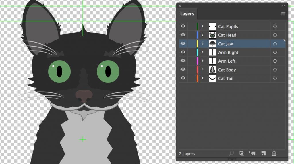
Create a character in Illustrator, Photoshop, or After Effects.  The character should be separated into layers appropriately and ready to import into After Effects for rigging.  If you would like to draw your character and scan it (or something similar), that is totally fine.  Send me your character – and their name – in whatever format you choose by class next Wednesday.

Categories
Weekly Lessons

Week 5: Introduction to Character Animation

The Illusion of Life

Let’s take care of a few more basics in After Effects and move on to character animation.  While After Effects is most often used for effects work and motion graphics, its versatile toolset makes it a very capable tool for animation.

Adjustment Layers

Adjustment layers are a very cool feature found in After Effects and some video and photo editing programs.  Basically, an adjustment layer is a blank layer in the timeline.  Any effects that you add to an adjustment layer will be applied to the layers beneath it.  Any layers above the adjustment layer will be unaffected.  This allows you to quickly apply effects to an entire scene.  If, for example, you decide you want your composition to be in black and white, you can add an adjustment layer and apply the “tint” effect to it.  Without the adjustment layer, you would have to go to each layer individually and apply the effect.

To create one, go the the Layer drop-down menu at the top of the page and go to New>Adjustment Layer.   An adjustment layer the size of your current composition will be created and placed in the timeline.  After Effects also lets you modify adjustment layers in interesting ways by using masks.  For example, you can use a circular subtract mask on an adjustment layer to create a simple vignette.  Note that while adjustment layers have transform properties, modifying those properties does not affect the layers below – only effects are applied.

If you do want to apply things like scale and rotation using an adjustment layer, it ispossible, however.  In the “Distort” section of the effects, there is one called “Transform.”  This is a set of the usual transform properties – anchor point, position, scale, rotation, and opacity – that can be applied as an effect.  If you add the transform effect to an adjustment layer, that effect will be applied to the layers below.

Pre-composing

When you create a new composition in After Effects, it appears in the project panel along with the rest of your media – that’s because compositions essentially are pieces of media, just like stills and video files.  This means that you can drag one composition into another and then add effects, mask it, or manipulate its transform properties.  In fact, it’s quite common to have compositions within compositions within compositions for a complex project.

In addition to dragging one composition into another, you can choose certain layers within an open composition and make a new composition out of them – without ever leaving the timeline you are working in.  After Effects calls this “pre-composing.”

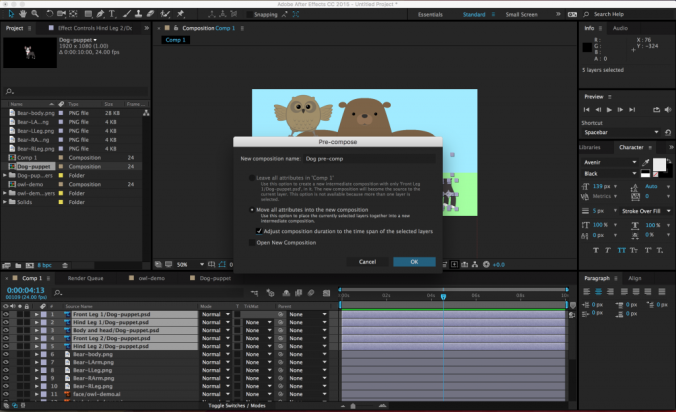
To pre-compose media in the timeline, select the desired layers (command-click to choose more than one layer), right-click and select Pre-Compose….  A menu will appear with options for re-naming the new composition (probably a good idea), leaving or moving the “attributes” of the layers (choose to move them), adjusting the length of the new composition (choose to do this), and opening the new composition (not necessary).

Once the layers have been pre-composed, the new composition will appear in the old composition as a single layer.  It will also show up as a new composition in the list of project media.  If you double-click on the pre-composition, it will open up in the timeline and preview windows.  Pre-composing media is a great way to clean up a chaotic composition (sometimes you just have way too many layers in there), as well as a simple method of applying effects and transformations to multiple layers at once.

Parenting

Parenting is a unique feature in After Effects and it’s incredibly powerful.  When you parent one layer to another, the “child” layer will be affected by the scale, position, and rotation of the “parent” layer.  Parenting does not affect opacity, effects, or masks.

To parent a layer, you use the Parent section of the composition panel.  You can either choose the parent layer from the drop-down menu or use the “pick whip” selector next to it (it looks like a little swirl).  A parent layer can have multiple child layers connected to it – and a child layer can have its own child layers – but a child layer cannot have multiple parent layers.  That probably sounds confusing, but it should quickly make sense once you start playing with it.

Parenting has some very basic and commonplace applications for things like lower thirds and title design.  For example, you could parent a text layer to a solid layer, then animate the solid layer sliding into the frame.  The text will keep its position relative to the solid and slide in with it.  This keeps your animation consistent and means that you only need to keyframe properties on one layer instead of two.

Under the Layer drop-down menu, you can also create a “Null” object (Layer>New>Null Object).  Null objects don’t appear to do anything at first, but they are very useful as parent layers.  You can parent several child layers to a null and then affect them all simultaneously.

Simple Character Rigging

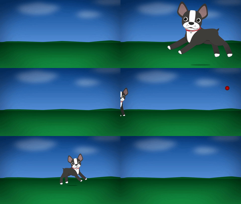
Now that we know how to parent objects, pre-compose layers, and adjust anchor points, we can move on to actual character animation.  Let’s start with some simple pre-made figures – you can download a few at this link.

A simple puppet might have the figure’s arms, legs, head, and body on different layers.  Complex puppets will break down the figure more and more – you might have separate layers for parts of the face, finger segments, clothing, and more.  Basically, any part of the figure that you want to animate should be on its own layer.

You can import these layers individually, but After Effects is also very good at playing with files created in other Adobe programs.  If you create your puppet in Photoshop or Illustrator, you can import those files with their layer structure intact.  When you import an Illustrator or Photoshop file, simply change the Import As drop-down from “Footage” to “Composition – Retain Layer Sizes.”  (The “Composition” option will work also, but I find “Retain Layer Sizes” easier to work with.)  If you’re using a Photoshop file, another screen may appear with the option to keep or merge your layer styles – I tend to choose “merge.”  Once you’ve imported the file, it will appear as its own composition with each layer separated out.  Note that you will only get the dialog box with these import options if you use  Cmd+I or File>Import – if you just drag an Illustrator or Photoshop file into the project window, all the layers will be combined into one piece of media.

With the puppet imported, you’ll want to begin parenting the different parts together – but first, you should think about each layer’s anchor point.  As we discussed previously, a layer’s anchor point is the point around which the layer scales and rotates.  Since we’ll be doing most of our animation using the rotation property, the anchor point is important.  For example, a hand rotates around the wrist, the forearm rotates around the elbow, and the upper arm rotates around the shoulder.  You can use the “pan behind” tool (its icon has four directional arrows in a dashed box – the shortcut is Y) to grab and move anchor points to their appropriate locations.

You can then parent the layers accordingly – in this example, the hand is parented to the forearm, the forearm is parented to the upper arm, and the upper arm is parented to the torso.  If you do this correctly, rotating the forearm will also move the hand and rotating the upper arm will move all three.  I realize that this is probably difficult to visualize, so take some time to play with parenting and anchor points.  Imagine your puppet is a marionette and think about where the hinges should be – that’s where your anchor points go.  Once the anchor points have been set and the layers have been parented, you can begin animating the puppet by rotating and moving the layers.  Don’t forget to turn keyframes on for any properties you want to animate!

One benefit to creating your puppets in Illustrator (or using shape layers within After Effects) is that the puppet can be scaled up infinitely without losing quality.  That’s because Illustrator is a vector-based program, as opposed to something like Photoshop, which uses pixels.  To enable this ability (it is turned off by default), you need to check a box in the timeline that looks like a little sun – if you hover your mouse over it, it will say “For vector layer: Continuously Rasterize.”  For pixel-based artwork, you will start to lose image quality as you scale up, but you can control how After Effects processes the image using the column next to the sun that looks like a pixelated diagonal line.

Puppet Pins

While animating using the transform properties can achieve very sophisticated results, the animated characters can sometimes look a little stiff.  When we watch a cartoon, we are accustomed to seeing things move in “elastic” way: stretching as they build up speed and squashing when they land.  We can achieve this effect in After Effects using Puppet Pins.

Set up your character in the same way we went over last time: position the anchor points on the joints, move the layers into position, and parent everything appropriately.  Once everything is in place, it’s time to add some pins.

Puppet Pins are a tool for deforming layers.  When you add pins to something in After Effects, the program generates a “mesh” over the object.  When you move a pin, that mesh shifts and the layer is deformed.  If you move a pin too much, you’ll get some funky results; the image will stretch too much and begin to tear.  Moving a pin just a bit can give some really interesting results, though.

To start adding pins, select the Puppet Pins tool from the menu bar at the top of the screen – it’s the one that looks like a pushpin.  In the timeline, select the layer you want to add pins to, then click on the layer in the composition panel to add a pin.  You should see a yellow dot appear where you clicked.

Every pin you add will “pin down” a part of the object.  That means that the more pins you add, the smaller the area that each pin will affect.  My general rule is to add three pins to each part of the puppet I want to animate in this way.  On an arm layer, I might add a pin near the shoulder, one near the elbow, and one near the wrist.  On a leg layer, I might add one near the hip, one near the knee, and one near the ankle.

Pins have keyframes turned on by default, so you will add a keyframe every time you move a pin.  However, you can still move or rotate the layer itself without adding pin keyframes.  I like to add pin keyframes to accentuate movements; for example, I might add pins to a swinging arm to give the movement some elasticity.  Note that pins are not affected by parenting layers to each other – they move independently.  If you can’t see the pins, you can highlight the layer and click on the Puppet Pins tool again, or find the Puppet section of the layer in the timeline.

Occasionally, your pin may pull the layer apart in an unexpected way.  This is usually because the mesh that the tool generates is not covering the entire object.  When you have the Puppet Pins tool active, you should see some options next to the tool icon at the top of the screen.  Clicking “Show” box next to “Mesh” will reveal the mesh that is being generated to deform the layer.  If your mesh is cutting off part of the object, either add triangles or increase the “Expansion” property.

Puppet Pins open up lots of new creative possibilities.  Use them to make your animations seem even more alive!

Project 5: Bring a Character to Life

This week, I’d like you to start experimenting with character animation.  You can download the sample files to use or create a puppet of your own.  If you choose to create your own puppet, you can use several approaches: you can create it in Illustrator or Photoshop, draw it on paper and scan it, or build it out of shapes and solids within After Effects.  Don’t get too bogged down in the character creation process, though – we’ll be focusing on actually creating characters next week.

Either way, create a five to ten second scene with the character of your choosing.  You can animate using transform properties, puppet pins, or a combination of the two.  As usual, render it as a QuickTime movie using the H.264 codec, upload it to your Google Drive, and send me a download link.

Categories
Weekly Lessons

Week 4: Modes, Masks, Text, and More

Manipulating Layers

One very basic action that we haven’t covered yet is the editing of a layer’s in and out-points.  By default, the entire length of a piece of media is dragged down into a composition and you may have noticed that there is no razor blade tool in the After Effects toolbar.  Instead, to trim the beginning of a layer, move the playhead to the desired in-point and hit option [.  Option ] will set the end point.   (Use alt on a PC.)  You can also click and drag on the ends of layers in a composition.

If you don’t hold down option, the [ and ] keys will move the layer without trimming it.  [ will move a layer so that its in-point is at the playhead location.  ] will move a layer so that it’s out-point is at the playhead.  These shortcuts allow you to adjust the length and position of layers in the timeline very quickly, once you’re accustomed to using them.

When you’re moving or trimming layers, it’s obviously important to have your playhead exactly where you want it in the timeline.  You can use the spacebar to play or move the playhead by clicking and dragging it with the mouse.  For precision, you can use page up and page down to move frame-by-frame forwards and backwards.  This is different from Premiere, which utilizes the arrow keys to move the playhead; in After Effects, the arrow keys adjust the position of the highlighted layer.  If you hold shift and press page up or page down, you will move the playhead ten frames instead of one.

You will also probably need to duplicate layers fairly often in After Effects.  This can be done by copy/pasting, but you can also use the  Cmd+D keyboard shortcut.  You can actually use  Cmd+D to duplicate all sorts of things in After Effects: shapes, text, entire compositions, and even effects.

One last note about layers: if you double click on a layer in the timeline, it will open that layer in a panel over the composition preview window.  This is actually not where you usually want to work, so if you accidentally double click on something, close the layer panel or click back to the composition preview window.

Trimming the Timeline

When you create a new composition, you are asked to define its length.  If you need to change the length of the composition, you can do so by going to Composition>Composition Settings… or using the Cmd+K keyboard shortcut.  Changing the duration in the composition settings window that appears will either add or subtract time from the end of the composition.  However, you can also trim the composition down from within the timeline panel.

At the beginning and end of the timeline, you’ll find blue handles – these define the “work area.”  (There are actually two sets of blue handles – the smaller ones can be used to zoom the view of the timeline in and out.)  You can think of the work area handles as After Effects’ equivalent of an in and out point.  If you drag the work area handles to the section of the timeline you want to keep, then right-click on the lighter area directly between them, you’ll see a few options appear.  Select “Trim Comp to Work Area” to remove everything outside the handles and shorten the length of the composition.

Masks and Shapes

As I previously mentioned, most of the media you add to your composition will have three kinds of properties: masks, effects, and transform properties.  You’ll find the mask tools up at the top of the screen in the tool bar.  There are preset mask shapes (hold-click to see the various options) and a pen tool for custom shapes.  Be sure to select the layer you want to mask in the timeline panel before clicking on a mask tool.

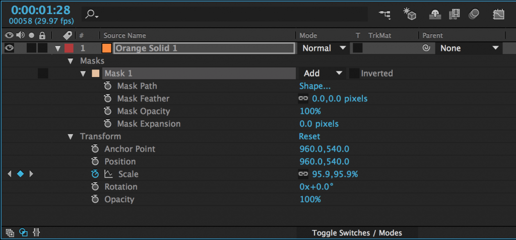
After you add a mask to an object (with either a shape tool or the pen tool), it will appear as a property of that layer in the timeline panel.  Next to the name of the mask, you’ll find a dropdown menu – the default value should be “Add.”  This means that the mask is “adding” that area and discarding everything else.  If you change this to “Subtract,” the area of the mask will be taken away and everything else will remain.  Choosing “None” will make the mask have no effect.  There are several other options as well, but add and subtract masks are what you will use most of the time.

There are a number of options for further modifying the mask, which are available by clicking the triangle to the left of the mask’s name.  Feather fades the edges; Opacity changes the transparency; and Expansion allows you to grow or shrink the mask.

Mask Path is the shape of the mask and by turning keyframes on for that property, you can animate that shape.  When the mask path keyframes are activated, you can move the points that define the mask or adjust their bezier curves.  If you click on the word “Shape…”, you can automatically change the mask to an ellipse or rectangle.

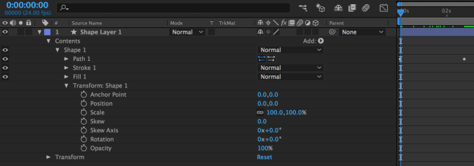
Shapes can be animated in a very similar way.  If look at the properties of a shape in the timeline, you’ll see a new category called “Contents.”  Under the shape’s name, you’ll find keyframe-able properties related to path, stroke, fill, and transform.  “Path” allows you to animate the shape of the shape, just like the shape of the mask can be animated. Stroke and fill control the color of the shape and the color and thickness of its border.  Transform is a second set of transform controls, applied before the regular transform properties.  There are a few extra properties in these new transform controls; they are related to the skew, or distortion, of the shape.

Effects

There are many effects built in to After Effects and countless more that can be added using plugins.  The effects are organized into categories under the Effects dropdown and in the Effects panel, which has a useful search bar.  Clicking on a piece of media in a composition and then choosing an effect in either location will add that effect and should bring up the Effect Controls panel.  The effect will also appear in the layer information of the composition in the timeline.

The list of effects can be found in two places.  The top dropdown menu has an Effects section with all the effects grouped into categories.  Simply go to the effect you want and click on it – it will be added to the selected layer.  There is also an “Effects & Presets” panel (you may need to find it using the Window menu).  This panel contains the same categories as the dropdown menu, but it also contains a search bar.  So if you know the name of the effect you want, just start typing it into the search bar and all the possible matches will appear.

When you add an effect, that effect will appear in the “Effects” section of the layer’s properties in the timeline (under “Masks” and before “Transform”) and in the Effect Controls panel.  The Effect Controls panel is best for getting your effect dialed in exactly like you want it – many effects have specialized controls and elaborate options.  The timeline window is best for refining and manipulating any keyframes that you add to your effects.  Remember that you can show all the keyframes that have been added to a layer by pressing the U key.

Text

In addition to media that you import, you can create layers to add to your composition from within After Effects.  The most common are solids and text layers.  To create one, go to the Layers dropdown menu at the top of the screen, select New, and choose Solid or Text. When you create a new solid, you’ll see a menu with options for name, size, and color.

You can create text in a composition either by selecting the text tool (Cmd+T on Mac, Ctrl+T on PC) or choosing Layer>New>Text from the top dropdown menu.  You can either draw a box for the text in the composition window or just click somewhere and start typing.  You can also double-click on the layer in the timeline window to begin editing the text.

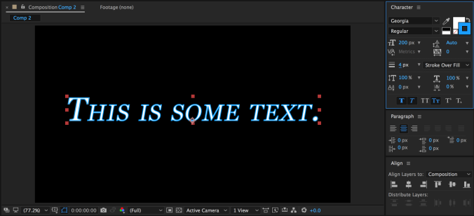
The “Character” panel in After Effects contains all the usual options for modifying text, as well as some unique controls.  You can change the typeface, size, fill color, stroke, and style; but you can also adjust the kerning and line spacing, add a faux bold or italics, switch to all-caps or small-caps, put text in sub- or super-script, and more.  You can highlight just part of your text and modify its properties separately.  There is a different “Paragraph” panel for adjusting the justification.


As you may remember, there are two text-related tools in the toolbar: one for horizontal text (this is what you’ll use most of the time) and one for vertical text.  What if you want your text to run along a specific path, however?  This can be achieved using the masking tools.  With your text layer highlighted, choose either the pen tool or a mask tool and draw a mask or path.  If you are using the pen tool (which is what I’d recommend), you do not need to close the path – you can simply create a line for the text to run across.

With your path drawn, click down to the “Text” section of the text layer in the timeline and find the “Path Options” section.  Next to “Path,” you should see a small dropdown menu – it will say “None” by default.  Open that menu and choose the path you’ve drawn – your text will snap to the path.  Some options for adjusting the position of the text on the path will also appear.

Transfer Modes and Track Mattes

Those of you with Photoshop experience may be familiar with transfer modes.  A layer’s transfer mode affects the way it interacts with the layers below it.  There is a “Mode” section of the timeline where this can be adjusted.  You may need to hit the “Toggle Switches/Modes” button at the bottom of the panel for it to become visible.

By default, the transfer mode should be set to “Normal.”  There are too many options to go through individually, but they are grouped together into sections.  The section with “Darken” at the top uses the dark areas of the layer to affect what is visible; the section with “Add” at the top uses the light areas.  You should experiment with the transfer modes to see how layers affect each other – you can get some really interesting results with them.

Next to the transfer modes are options for “Track Mattes.”  A track matte tells a layer to look at the layer above it for certain properties.  The “Alpha Matte” and “Alpha Inverted Matte” are particularly useful.  For example, if you put a text layer above a video layer and then set the track matte of the video to Alpha Matte, the video layer will have the shape of the text layer.  Alpha Inverted Matte will cut out the shape of the text.

Animate Text

As you can see, there are many ways of manipulating text in After Effects.  However, there is a whole other category that we haven’t yet discussed: animation presets.  There are actually animation presets for all sorts of things, but the text presets are particularly fun.  To use them, you’ll need to go to the Effects & Presets panel; *Animation Presets is the first option.

Within the Animation Presets category, you’ll see several subcategories.  Go down to Text and open it up.  There, you’ll see many more subcategories such as Animate In and Animate Out, Graphical, Mechanical, Organic, and lots more.  Animate In and Animate Out do just that – they automatically animate the text moving on or off of the screen.

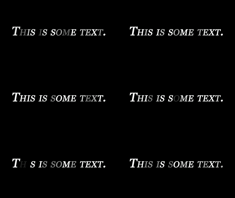
The other categories of animation presets add things like movement, graphical elements, or light effects to text.  For example, the Flicker Exposure effect in the Lights and Optical category makes each character in a text layer randomly flicker.  This is a fairly simple effect, but it would be very tedious to create it manually; the animation presets make it simple.

Many animation presets can be manually customized after they are applied.  To do this, go back to the “Text” section of the text layer in the timeline – there should be a new section called “Animator” followed by a brief description.  You can dig through the animator options to alter the animation preset, or highlight and delete it to remove it.

Project 4: Animated Wordmark

I’d like you all to create some animated text – something like an animated logo that you can use to identify your work.  It can be your name, a brand name of your own creation, or any name you’d like to use as a personal identifier.  If you’d like some media to use, here is some generic slow motion stock footage – although you are welcome to use any footage or other media you like.

Your finished graphic should be under 10 seconds long, feature some sort of text element, and be rendered as a QuickTime movie using the H.264 codec.  If the resulting file is small enough, email it to me directly – otherwise, upload it to your Google Drive and send me a download link.