Categories
Weekly Lessons

Odds & Ends: Particles

Particle Madness

So far, we’ve created 3D objects and cameras in After Effects.  Let’s explore another 3D topic with one of After Effects’ coolest features: particles.  Particles can be used to create all sorts of interesting effects, including rain, snow, smoke, flames, fireworks, stars, and a lot more.  Even as a purely abstract aesthetic element, particles can add a lot to a composition.

If you look under the “Simulation” section of the effects, you’ll see that there are actually a few different particle-related options: CC Particles Systems II, CC Particle World, and Particle Playground.  We’re going to be focusing on CC Particle World, since it’s the only effect that works in a 3D environment.  Many of the options in Particle World can be applied to the other particle simulation effects as well, so learning this one will give you a good head start on using the others.

If you do any online searches for particle techniques in After Effects, you will probably see another effect mentioned a lot: Trapcode Particular.  Trapcode encompasses a suite of effects made by the third-party company Red Giant.  Of all the many effects, scripts, and presets that can be added to After Effects, Particular is easily one of the most popular.  It offers more advanced controls and options than the built-in effects do, but it doesn’t come cheap: Particular by itself costs several hundred dollars and the entire collection of Trapcode effects runs around a thousand.  If you end up doing this kind of work professionally, Particular is absolutely worth investing in – but you can still do a lot with After Effects’ built-in Particle World and it’s the perfect tool for learning the basics.

Particle World

CC Particle World is an effect, which means it needs to be applied to something.  First, create a new solid, the same size as the composition you are working in.  Even though we’ll be working in 3D, you can leave the solid as a 2D layer.  Add the Simulation effect CC Particle World to the layer and you should see an immediate change.
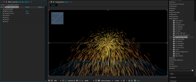
The solid you were working with should have disappeared – in its place, you should see something that looks a bit like a firework, along with a 3D grid and some other guide marks.  When you apply Particle World, the effect begins to emit particles from the start point of the layer it is applied to – so you should see particles shoot out as you scroll through the timeline.

The first thing I’d recommend doing is turning off the grid, guides, and other extraneous information.  In the effect controls, the first section of the effect is Grid & Guides – feel free to uncheck the boxes for position, radius, motion path, grid, horizon, and axis box.  Once we start exploring the composition with a 3D camera, some of these options may be useful, but they can always be switched back on.

Below the Grids & Guides section is Birth Rate, which determines how many particles the effect will generate.  This is determined by a slider that goes from 0 to 20, but these numbers don’t correspond to the actual number of particles on the screen – the default value, 2, probably produces hundreds of particles per second.  If you want a small number of particles, set this number very low – the lowest number you can type in is .01.  For lots of particles, set the number higher, but be aware that your computer may begin to slow down.

The next control is for Longevity (sec), which determines how many seconds each individual particle will remain before disappearing.  If your particles exit the screen quickly, you may not realize that they are disappearing, but you should see the overall radius of your particle group change by lowering this number.  A particle’s color, size, and opacity can change over its lifespan, so this is an important variable.
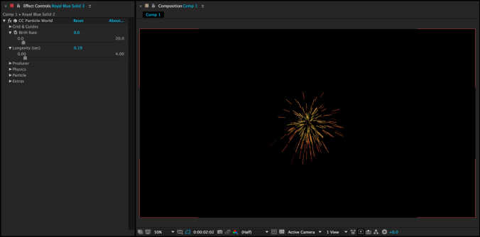
Below the Longevity are controls for the producer of the particles.  These are used to determine the position and size of the particles’ origin point.  Remember to use these controls to change position – not the position property of the solid layer that the effect is applied to.  By adjusting the three radius controls, you can make the particles emit from a tiny point, a sphere, a disc, or a line.

After the Producer controls are some of the most interesting options in the effect: the adjustments for physics.  The Animation dropdown menu determines how the particles are emitted: Explosive shoots them out in all directions, Direction Axis shoots everything one way, Twirl sends things in a complex swirl, and so on.  There are lots of options with very different results, so feel free to try several of them.  Besides Animation, the most important settings under Physics are probably Velocity, Gravity, and Resistance.  Velocity is the speed at which particles are sent from the emitter; Gravity can be set to a positive number (particles fall down), negative number (particles float up), or zero (particles move in the direction they are shot); Resistance slows particles down as they move through space.  Depending on which Animation option you choose, you may or may not also have access to the controls under Direction Axis.
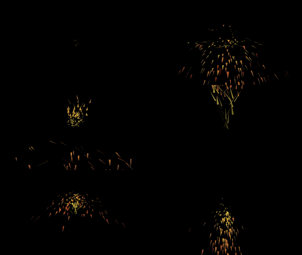
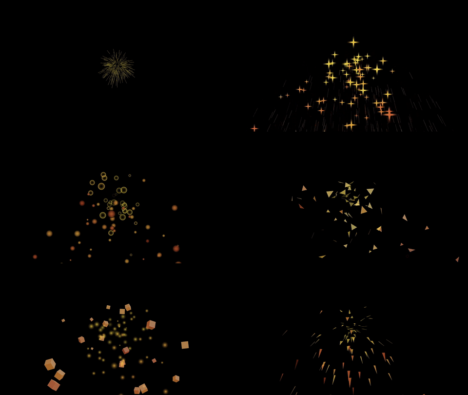
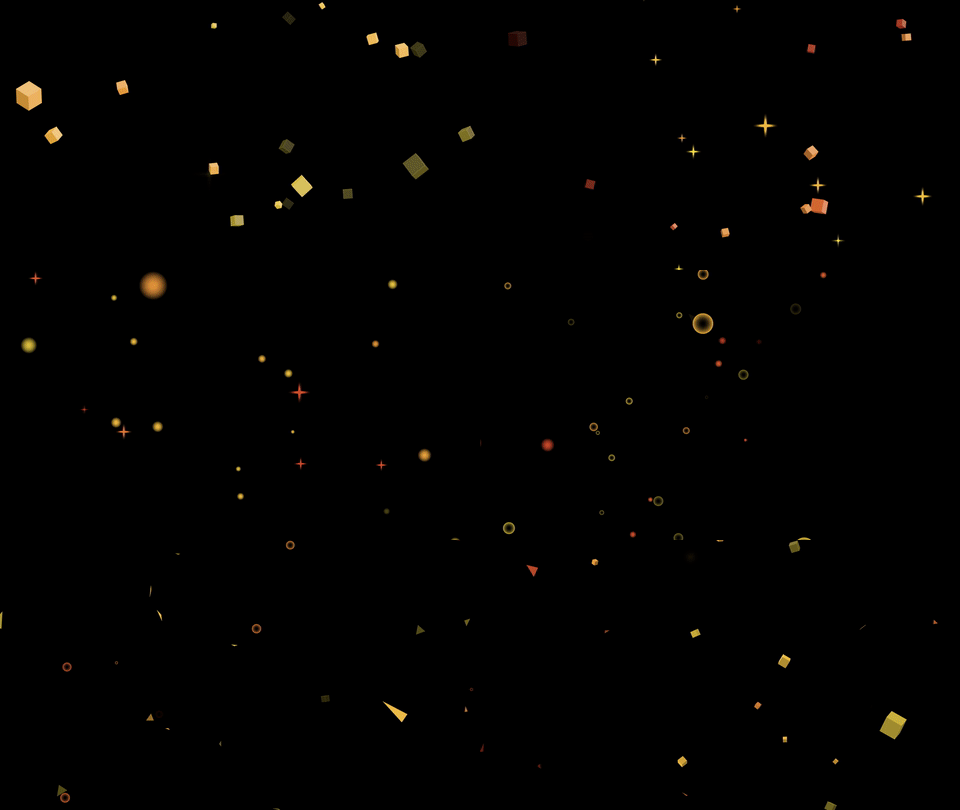
Finally, below Physics are the controls for the particles themselves.  Particle Type is the first option and it controls the overall shape of the emitted particle – the possibilities include spheres, lines, stars, cubes, and mores.  The bottom three options are “textured,” which means that you can use another layer in the composition (set immediately below) in them.  Depending on which particle type you select, different options will be available in this section – there are lots of different combinations, so feel free to experiment.  Some particles, such as 3D shapes and those with textures, are much more resource-intensive than others, so be aware that you may experience some computer slowdown.
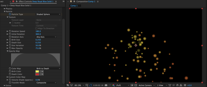
Since different options will be available depending on your particle type, I’m only going to focus on the most important ones here.  The birth and death size determine the size of the particle when it first appears and at the point it disappears – remember, the lifespan was determined earlier with the Longevity (sec) setting.  By setting the birth and death size to different numbers, you can make the particles grow or shrink over time.  The Size Variation introduces a degree of randomness into this setting.

The Max Opacity and Opacity Map settings control how the particles fade in and out.  If the Max Opacity is 75% (the default value), the particles will remain slightly transparent even after fading in completely.  The Opacity Map lets you draw how the particle’s opacity changes over time.  This means that particles can fade in and out over their lifespan, appear suddenly and disappear slowly, or simply fade in and out.  The color options are similar in that they let you set a start color and an end color for the particle – use the Color Map dropdown to choose a preset pattern.
Particles in Space

As I mentioned earlier, the cool thing about Particle World is that the particles exist in 3D space even though the solid the effect is applied to is 2D.  That means that you can drop a camera into the scene and navigate it through a field of particles for a very cool look.
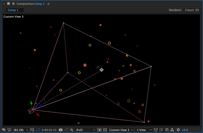
To move your camera through a field of 3D particles, you may want to create a 3D null object (Layer>New>Null Object, then turn on the 3D switch for that layer), parent the camera to it, and then keyframe the position or rotation on the null to move the camera through the field.  You could also keyframe your camera’s position and rotation without using a null, but I find that it often makes camera movement a bit simpler.  In addition to using moving particles, you could also keyframe the birthrate and resistance variables to freeze the particles in place – there are tons of different effects that can be achieved.  Experiment and have fun!
Categories
Weekly Lessons

Odds & Ends: Virtual Lights

Four Kinds of Light

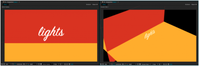
As we previously discussed, adding a virtual camera to a 3D scene in After Effects can give an entirely new dynamic quality to your compositions.  Virtual lights can have a similar effect.  The following simple scene is composed of four 3D layers: a red background “wall” layer, a yellow “floor” layer, a text layer, and a camera.  If you were to just glance at the composition, though, you wouldn’t know the scene was 3D at all – you have to switch to one of the “Custom Views” to see how things are arranged.

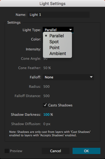
We can make this scene more interesting by adding lights.  Lights are created in the same way as virtual cameras and other kinds of layers: from the top menu, choose Layer>New> and then choose Light….  A menu will appear with several options, the most important of which is “Light Type.”  The kind of light you create will completely change how it affects the scene.  For each type of light, you can define the color and intensity.  Additional parameters will be available depending on which kind of light is selected.

Parallel:  These are rays of light cast in a certain direction.  Parallel lights behave similarly to outdoor sunlight and can cast shadows.  By default, parallel lights do not “fall off”, so it does not matter how close or far they are from the things they illuminate.  Changing the Point of Interest on a parallel light will change the direction it casts light in.


Spot:  This is a cone of light that is brightest in the center, then fades to darkness.  You can adjust the angle and “feather” of the cone and spot lights can cast shadows.  Spot lights have the most potential parameters to adjust – in addition to the light’s position, you can change its point of interest, orientation, and rotation on the X, Y, and Z axis.

Point:  This is light emanating in all directions from a point in space.  Like all light types, the point light itself is invisible – there is no glowing orb where the light is located, only its effects are visible.  Point lights can cast shadows and are brightest close to the location of the light.

Ambient:  This is light emanating from everywhere at equal intensity.  Because light is coming from all directions, ambient lights cannot be used to cast shadows.  Ambient lights are helpful when used in addition to other types of light, since they can change the illumination level and color of a composition uniformly.

Casting Shadows and Material Options

When you create a new parallel, spot, or point light, you will have the option to check a box that says “Casts Shadows.”  However, you will also need to tell After Effects which layers in the composition are affected by the light’s ability to cast shadows.  By default, every 3D layer can receive shadows (a shadow will show up on that layer when it is cast by another layer) but not cast shadows.

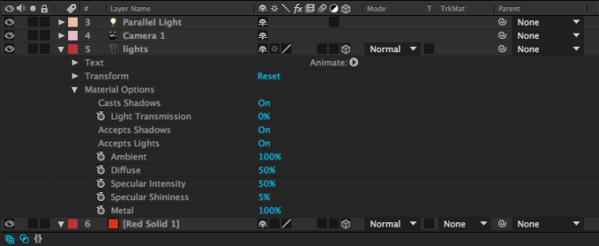
To change this and make your layers actually cast shadows, you’ll need to look at the “Material Options” for the layer.  These are found below the “Transform” properties in the timeline window.  The first option is “Casts Shadows.”  In the same category are options for “Accepts Shadows” and “Accepts Lights,” both of which are “On” by default and both of which you can probably leave that way – unless you specifically want a layer to not be affected by the lights in your scene.

There are other areas you can adjust in the Material Options – shininess, diffusion, and more.  While these parameters can be fun to play with, don’t be surprised if they don’t make a dramatic difference; many of these properties (like “Specular Intensity”) are most apparent on curved surfaces – and 3D layers in After Effects are flat.  I generally don’t do much with the Material Options besides enable or disable shadows.

Illuminate Things!

Now that you know what the different kinds of lights can do, use them creatively to add an extra layer of interest to your compositions.  Remember that almost every parameter – color, intensity, position, point of interest, etc. – can be keyframed.  Also remember that lights, like cameras, only affect 3D layers in After Effects; nothing will show up until you click on that little 3D box icon for the layer in the timeline window.  Have fun!

Categories
Weekly Lessons

Odds & Ends: Lip Syncing

Read My Lips

If you’d like some media to try this with, you can download an Illustrator file, audio clip, and After Effects project file at this link.

I’m not going to lie: doing lip syncing is one of the most time-consuming parts of the animation process.  Much like walk cycles, effective lip syncing involves a lot of finesse and fine-tuning – and if it’s slightly off, it just won’t look right.  That being said, it’s really cool to see characters that you create suddenly speak; it makes them seem that much more alive.

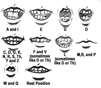
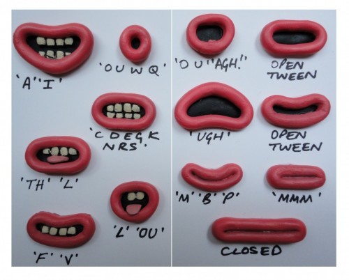
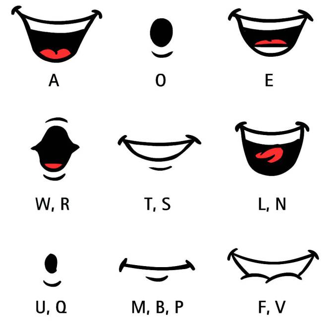
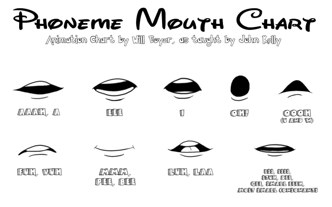
The key to good lip sync lies in using different mouth shapes for different sounds (also called phonemes).  Because the mouth moves quickly when speaking, you can generally just cycle through these different shapes to make it look as though a character is voicing lines.  Different sources will give different numbers of mouth shapes for lip syncing.  For very simple animation, you can actually get away with just two or three: an open mouth, a closed mouth, and maybe an “oh” mouth.  For really good lip syncing, however, you probably want to use six or more mouth shapes to represent unique phonemes.  Here are a few mouth shape reference pictures, from various sources online:

As you can see, all of these use nine or more unique mouth shapes.  The positions of the tongue, lips, and teeth make a big difference; for example, the top teeth touch the bottom lip during “f” and “v” sounds and the teeth touch the back of the top teeth during “t” and “d” sounds.

To create a lip sync animation, you should start with a pre-recorded audio track – don’t try to animate the mouth before you have the audio, the timing just won’t work.  Create multiple mouth shapes for your puppet using the platform of your choice: Photoshop, Illustrator, After Effects, or something else.  Use one of the guides above (or another – there are lots online) as a guide to create the phoneme shapes.  Again, the more shapes you create, the more believable your lip sync will be.

In the example files I’ve provided, there are mouth shapes for the following sounds: a closed, neutral mouth; a surprised open mouth; ah; ee; i; oh; ooo; d; f; m; l; k; and th.  Although I’ve labeled these shapes with a single sound each, most of them can be used for multiple phonemes.  For example, you make the same mouth shape when you make an “f” sound and a “v” sound.

Lining It All Up

To actually create the lip sync animation, you simply drop the audio clip into your timeline and swap between the appropriate mouth shapes for each sound in the clip.  This is the tedious part of the process, but there are a few things we can do to make things easier.  First, make the waveform for the audio file visible – hit LL on the keyboard with the layer highlighted.  As you animate between the different shapes, you can “scrub” through the audio by holding command on the keyboard (ctrl on PC) and moving the playhead in the timeline with your mouse.  This will really help you figure out which sound come when in the timeline.

You can alternate between multiple mouth shapes in a few different ways.  The simplest would probably be to just use a new layer every time.  You could also keyframe the visibility of each layer using opacity.  Neither of these approaches is ideal, though; both will create messy timelines that are difficult to adjust later.  I’ve looked through many guides to creating lip sync animation in After Effects and they all recommend the same approach.  Like many things in After Effects, it’s a little complicated to set up, but it will make things much simpler as you go.

The first step is to create a new composition with all of the mouth layers visible and stacked on top of each other.  Now, these next steps will probably sound a little strange, but they’re important.  Each layer needs to be a single frame long – so highlight each layer, move the playhead in the timeline to the 00:00 mark, and hit alt and ] on the keyboard – this will trim each layer to the correct length.  Next, the layers need to be in sequence.  You can do this manually, or by selecting all the layers and going to Animation>Keyframe Assistant>Sequence.  Hit OK and the layers should move down the timeline in sequence.

Now, you need to make the composition the exact length of the sequenced layers.  To do this, move the playhead in the timeline to the last mouth shape and hit N on the keyboard – this will create the end point.  If your start point isn’t at the start of the composition, move the playhead to the beginning and hit B.  Highlight the area between the start and end point, right-click and choose “Trim Comp to Work Area.”  The length of the composition will shrink down to the length of all the layers in sequence.

You should now have a composition containing only mouth layers, each of which lasts for a single frame.  Drag this composition into the composition with the rest of your puppet and position it in the correct place on the head – you may want to use a masking tool to trim unwanted areas of the composition and parent the “mouths” composition to the head layer.

Next, right-click on the mouths composition and choose Time>Enable Time Remapping.  Extend the time-remapped layer so that it fills the composition (if this doesn’t happen automatically) and delete the second (only the second) keyframe in the timeline under Time Remapping.  Right-click on the remaining keyframe – it should be at the very beginning of the timeline – and choose Toggle Hold Keyframe.  You should see the shape of the keyframe change.

If you’ve done everything correctly, you should have a layer in your composition that allows you to switch between any of the mouth shapes you created by typing that mouth shape’s frame number into the Time Remap property.  So, if your character makes an “L” sound and the L mouth shape is frame number five in the mouths composition, you just type “5” into the Time Remap value.  The “Toggle Hold Keyframe” property means that the number you type in will remain until you type in a new one – After Effects won’t try to automatically animate between the keyframes.

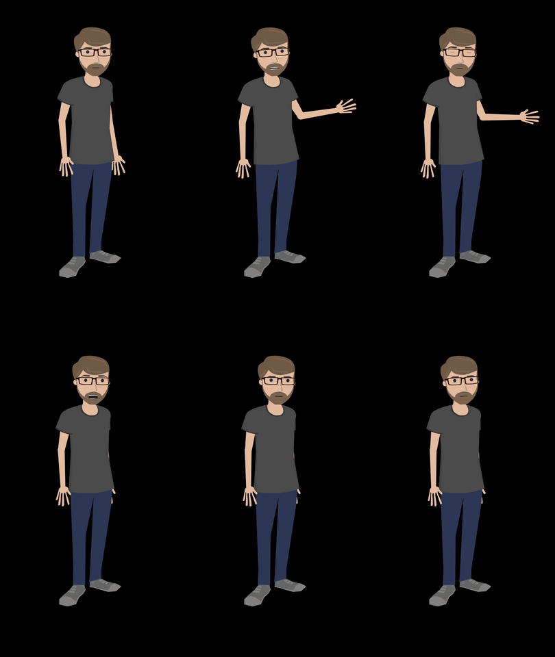
With everything set up, animating lip sync is just a matter of slowly going through the timeline and matching up the audio with the appropriate mouth shapes.  When this is done, don’t forget to animate the rest of the character as well – as people speak, it’s normal for them to move their eyes, hands, and body.  Combining all of these will really make your character seem alive.

Below, I’ve collected several tutorial videos on creating lip sync animation in After Effects.  Some make minor variations, but they all use an approach similar to the one discussed in this lesson.  If you want to get really advanced, you can drop a slider control effect onto the mouths comp (some tutorials suggest this) and link the time remapping to it – although I personally feel like that’s an unnecessary level of complication.

https://www.youtube.com/watch?v=-RbdON3vcpk

https://vimeo.com/101931706

https://www.youtube.com/watch?v=gfj7AOz7hUM

Categories
Weekly Lessons

Week 12: The Third Dimension

Lost in Z-Space

So far, we’ve used After Effects for 2D motion graphics and animation work.  After Effects can also be used for 3D work – although there are some caveats.  After Effects is not designed to do 3D graphics work in the same way that programs like Maya, Cinema4D, and Blender are.  You can’t create detailed 3D models or complex environments in After Effects.  However, you can move 2D assets into the third dimension – and create some unique and dynamic results.

This week, we’ll be creating a simple 3D scene.  Download the images at this link if you’d like some media to play with.

From 2D to 3D

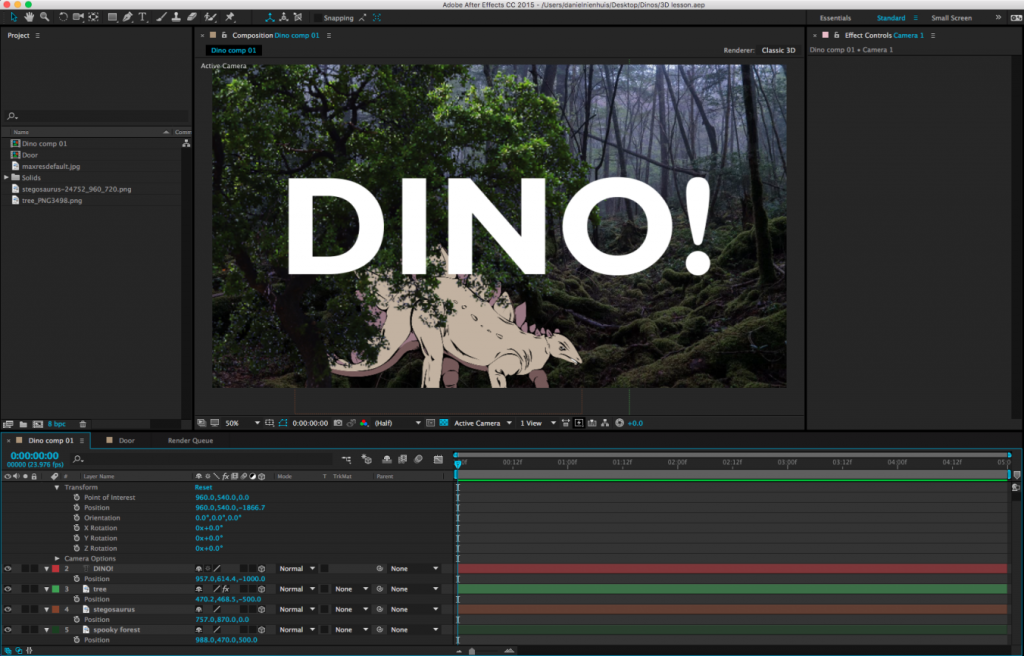
You may have noticed a series of symbols at the top of the timeline window, next to the Layer Name column.  If you can’t see them, toggle the view options at the bottom-left of the timeline window.  These symbols represent different properties that can be turned on or off for each layer.  For example, the symbol that looks like a strip of film toggles frame interpolation, which is only applicable to video layers.  The box we want to use looks like a little wireframe cube.  This switches layers from 2D to 3D.

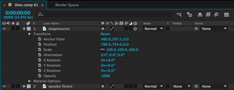
Clicking on this box will probably not make an immediate change to the way your composition looks.  However, if you look at the Transform options for that layer in the timeline, you’ll see that the possibilities have expanded greatly.

Position, for example, was formerly defined by two numbers – a value on the X (horizontal) and Y (vertical) axis.  In other words, that layer could formerly move up-and-down and side-to-side.  With the 3D box checked, a third number has been added – we can now move forwards and backwards on the Z (depth) axis.  The anchor point value has also gone from two variables to three.  Rotation was previously described by a single number, but now objects can be rotated three ways.  There is also a new “Orientation” value, which provides another set of rotation values.  Scale has gained a third number as well, although the new Z-scale value won’t generally affect 2D layers.

3D Rotation

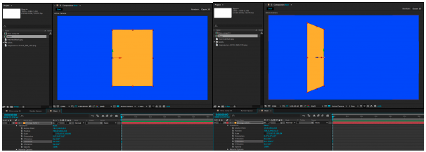
Let’s look at the rotation values first.  X Rotation spins an object around a horizontal axis, Y Rotation spins around the vertical axis, and Z Rotation spins around the depth axis (2D layers can only spin around the Z axis, so X and Y are the new options).  The best way to understand how these work is just to take some time playing with the values.  Remember that layers rotate around their anchor points.  So, if you want an object to swing open like a door, you’ll need to move the anchor point to the side of the object and keyframe the Y Rotation.  If you don’t change the anchor point, the object will spin around its own midpoint.

X, Y, and Z Rotation each have their own section under the Transform properties.  The Orientation section combines all three into a single keyframe-able value with three numbers.  I tend to use the individual Rotation values more than Orientation, but they both do the same thing.

It is possible to work with both 2D and 3D layers in the same composition, but they don’t really “interact” with each other.  If you rotate a 3D object so that it intersects with another 3D object, one will be “clipped” by the other.  A 2D object will simply float in front of or behind a 3D object, depending on its layer position in the timeline.

3D Position

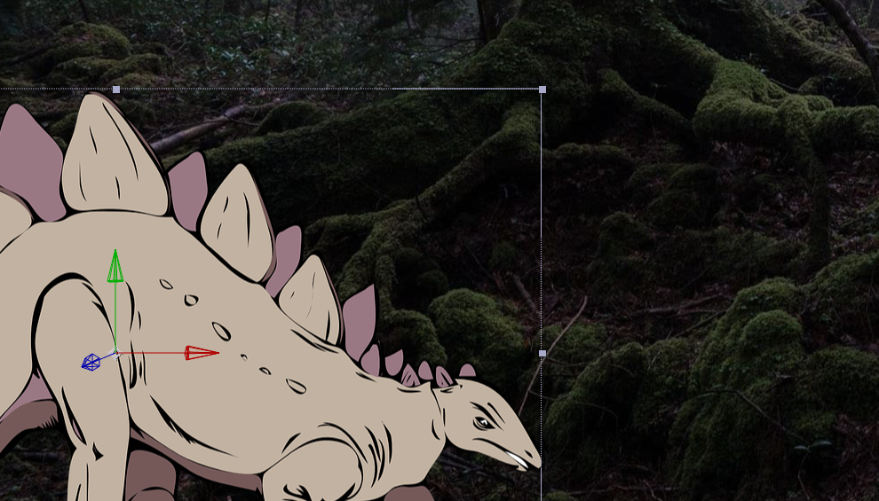
When you click on a 3D layer, you will probably notice a new icon appear in the composition window.  This icon is comprised of a green, red, and blue arrow, centered on the anchor point of the layer.  You can click and drag on the green, red, and blue arrows to move an object along the X, Y, and Z axis, respectively.  You can also change these values using the three numbers that now appear next to “Position” in the layer’s transform properties in the timeline window.

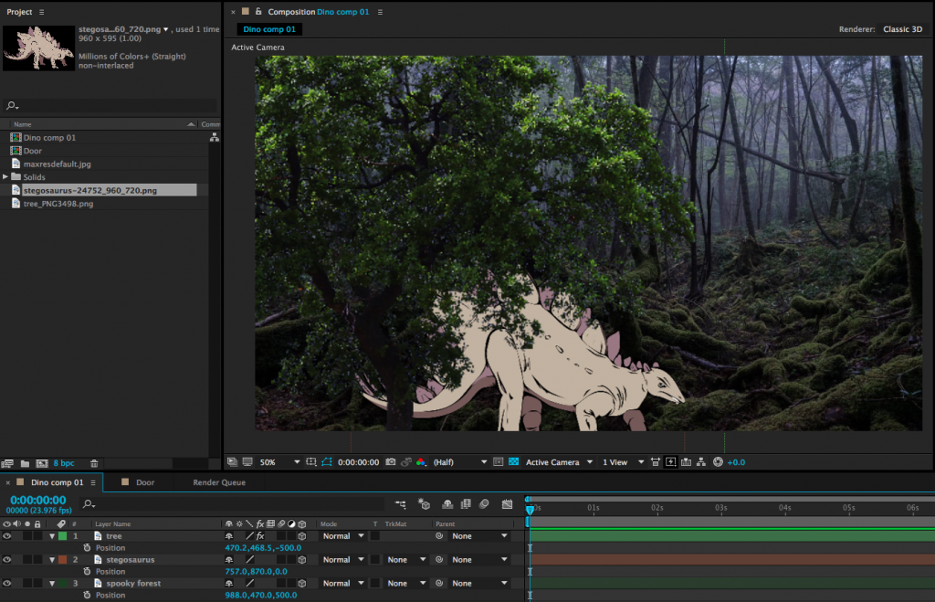
Entering a positive value for the Z position (the third number) will push the layer further away; entering a negative value will pull the layer forward in 3D space.  This may be somewhat counter-intuitive, so take some time to familiarize yourself with it.  To create a very simple 3D scene, you might enter a positive Z position value for the background layer, a negative Z position value for the foreground layer, and 0.0 for the Z position value of the middle layer.  As these layers get moved along the Z axis, their size will appear to change.  You can compensate for this by adjusting the scale.

This can give us a nicely layered composition, but so far, we haven’t done anything we couldn’t do by adjusting the scale and position of 2D layers.  For example, you can make an object appear to move closer by increasing its scale.  So why use 3D position?  One reason is that it can be difficult to estimate the way that scale and position should correspond.  The other reason has to do with perspective and an effect that we can achieve only by using 3D layers – but for that technique, we’ll need a virtual camera.

A Virtual 3D Space

In our 2D work, we used the After Effects composition window sort of like a collage board; flat layers were placed on top of each other, rearranged, and adjusted.  When we switch layers from 2D to 3D, that collage board becomes more like a shadow box; objects can move forward and backward in space.  Our perspective on the shadow box hasn’t really changed, though – our view is fixed.  By adding a camera to the scene, we can change our perspective and even move into the scene itself, going from a shadow box to a complete virtual environment.

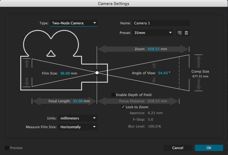
To create a camera, go the the Layer dropdown menu at the top of the screen and choose New>Camera….  This will bring up a dialog box with lots of options.  You can dig into these values and customize your virtual camera as much as you like, but I’d recommend leaving most settings at their defaults, at least to get started.  The one thing you may want to adjust is the Preset, which has a handful of simulated lens options.  These act just like lenses on real cameras: wider lenses (lower numbers) have a larger field of view and Z axis movement will be exaggerated.  Longer lenses (higher numbers) have a narrower field of view and Z axis movement will be compressed.  If you aren’t sure what to use, either the 35mm or 50mm presets are generally safe, middle-of-the-road options.

After you create your camera, you may notice an immediate difference in the scale of the objects in your composition.  This is because of the aforementioned properties of the lens on your virtual camera.  If you tip down the triangle next to the name of your camera layer in the timeline, you will see Transform properties and Camera Options.  The Camera Options section contains a ton of variables to play with – you can define the virtual depth-of-field, the shape of the simulated iris, the size of the aperture, and much more.  

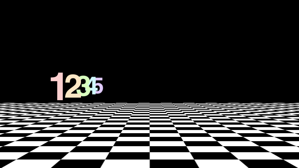
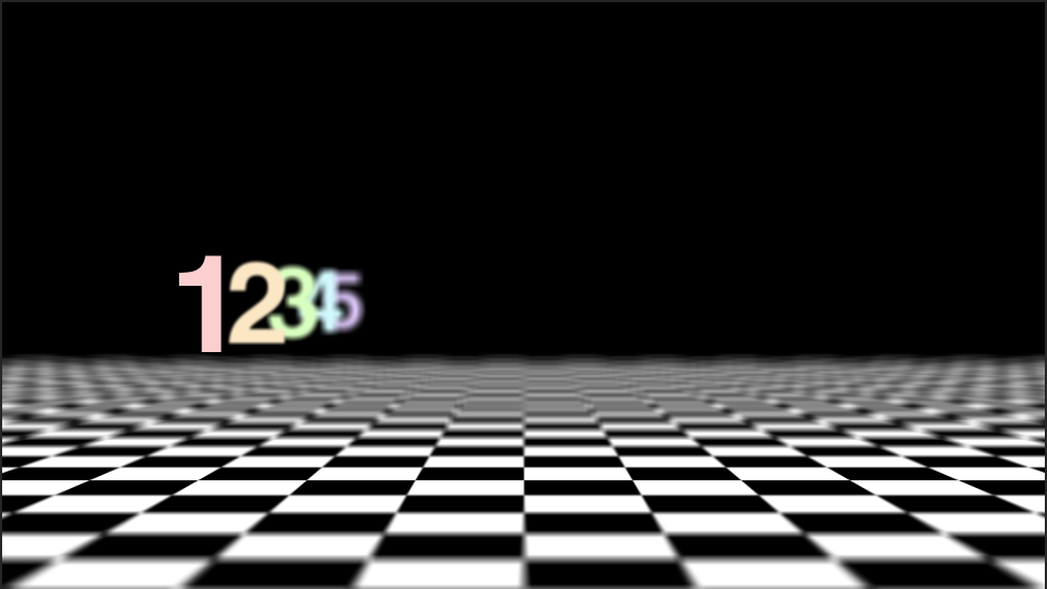
Turning Depth of Field “on” is probably the setting that will give you the most interesting results.  Depth of field describes how much of an image is in focus.  If a scene has a deep depth of field, lots of things at various distances from the camera will be in focus.  If a scene has a shallow depth of field, only a narrow sliver of the scene will be in focus.

If you have some experience with photography, those basic principles will help you as you define things like focal length and depth of field in the virtual cameras that After Effects uses.  For example, you may be aware that a lens with a large aperture produces images with a shallower depth of field than a lens with a small aperture.  Increasing the Aperture value in After Effects (which is measured in pixels) will therefore give you a more blurred out background when the Depth of Field toggle is enabled.  For reference, the Aperture in the image above is around 400 pixels and the lens is 50mm.  If this is unfamiliar to you, you may just have to experiment with the controls a bit to get the results you are looking for.

Moving the Camera

The Transform options control camera movement.  You can keyframe the rotation along all three axis, either individually or using the Orientation.  The position works the same as other 3D layers, but there is also a keyframe-able Point of Interest property.  This is the point that the camera is aimed at; so, for example, if you keyframe the camera’s position along the X axis, but don’t adjust the Point of Interest, the camera will move from one side to the other while remaining aimed at the center of the screen.  You can get some cool results this way, so take some time to play around.

 In addition to the control options in the timeline window, you can adjust your camera using a section of tools in the toolbar at the top of the screen.  The default option is the “Unified Camera Tool” (which looks vaguely like a movie camera), but there are several to try out if you prefer more “hands-on” control.

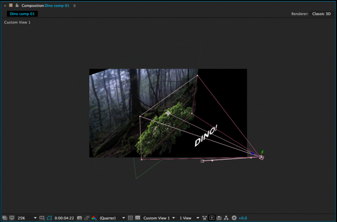
If you’re having a hard time visualizing how exactly your camera is moving, it can be helpful to change the view setting of your composition window.  At the bottom of the window is a dropdown menu that, by default, reads “Active Camera.”  Clicking this will give you different options for viewing your composition in 3D space.  In particular, Custom Views 1, 2, and 3 are helpful for seeing how your camera is positioned and where it is pointed.  Note that you may need to toggle the background visibility on or off (the checkerboard icon next to the view setting) and/or zoom out your view to see what’s going on clearly.  Just switch back to “Active Camera” when you’re done.

There are many more things to explore when it comes to 3D work in After Effects.  You can create different kinds of virtual lights, control the way simulated shadows are cast, affect how shiny or matte objects are, and so on.  For now, though, just get used to moving objects in 3D space and operating a virtual camera – it will open up a whole new world of creative possibilities.

Optional Assignment: 3D Scene

I want you to be able to focus on your final projects right now, so I’m not assigning a project this week.  However, if you have a missed assignment from sometime during the semester and would like to make it up, you can create a five to ten second composition that uses 3D objects and a moving camera.  Render it as a 1920 x 1080 QuickTime movie using the H.264 codec, upload it to your Google Drive, and send me a download link.

Categories
Weekly Lessons

Week 11: Expressions

Coding Animation

If you’d like some media to use for this lesson, you can download some fun Victorian-style woodcut art at this link.

Adding keyframes is one way of animating properties in After Effects, but there is another method as well – using expressions.  An expression is essentially a line of simple code that is applied to an animatable property.  It’s not the same as writing computer code – you don’t need to know any specific programming language, or anything like that – but the idea is similar.  To add an expression to a property, alt-click on the stopwatch icon that you usually use to turn keyframes on and off.  The value associated with that property will turn red and a box of text will open in the timeline window.  That window is where you add the expression.

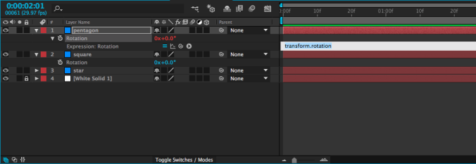
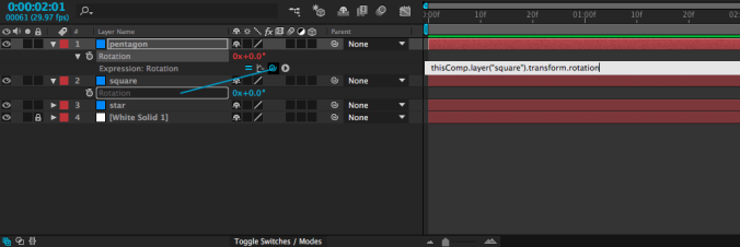
Probably the simplest kind of expression – and one of the most useful – adopts the value of a property on another layer.  For example, you could take the rotation value of one shape and apply it to the rotation of another shape.  When you create an expression, four small icons will appear, one of which is the swirly “pick-whip” icon that we previously used to parent layers.  If you use the pick-whip to select the rotation property on a different layer and then hit “enter” (or click outside the text box), whatever value is entered for that layer will be used for the layer with the expression.

I realize that may sound confusing, but it’s fairly simple in practice.  It means that you can animate a single layer and use it to affect other layers.  Simply animate the first layer, then use an expression on the others.  Try it out – once you get used to the process, you might find yourself using this particular expression a lot.

One small thing to keep in mind as you are entering expressions: the “enter” and “return” keys do different things.  One (enter) closes the text box, the other (return) adds a line to the current expression.  You can also close the text box by clicking outside of it in the timeline.  If you want to remove an expression, alt-click on the stopwatch icon again and it will return to normal.

Math

One thing that’s neat about expressions is that they can be easily combined or modified.  If, for example, you wanted to use the rotation expression above, but make the layer with the expression rotate the opposite way of the layer it gets linked to, that’s very simple.  Just use the pick-whip to select the layer with animation, then type *-1 (multiply by negative one) after the expression in the text box and hit “enter.”

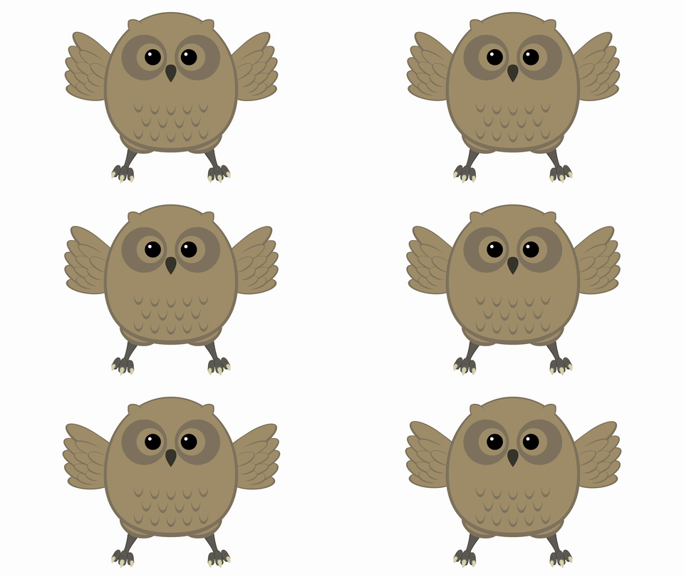
This technique can be very helpful for things like animating a bird flap its wings, since you can animate both wings with one set of keyframes.  Furthermore, any changes you make to that set of keyframes will automatically affect both layers.

There are a lot more expressions that you can use to automate all sorts of properties in many different ways.  One that you might come across uses the timecode of the composition, often multiplied by a number.  If you add an expression to the rotation property of a layer and type time, the layer will rotate to one degree at the one second mark, two degrees at the two second mark, etc..  If you type time*100, it will rotate to 100 degrees at the one second mark, 200 degrees at the two second mark, etc..  This is a simple way to add continuous animation to a property, regardless of the length of the composition.

Get Random

I’ve been using rotation in my examples so far, because it’s an easy property to visualize.  Anything that can be keyframed can be affected by an expression, though – opacity, position, scale, and even the individual parameters of effects.  One of my favorite expressions, wiggle, applies random values within certain limits.   It can be used, among other things, to create unpredictable, organic-seeming movement when applied to the position of a layer.

To add wiggle to the position of a layer, alt-click on the Position keyframe icon in the Transform properties.  A text box will open in the timeline – in it, type wiggle, then two numbers in parentheses, separated by a comma.  For example: wiggle(2,150).  The first number in this expression is the frequency: 2 equates to two times per second.  Entering a 3 would be three times per second, and entering .5 would be half a time per second (or once every two seconds).  The second number is the amount to move.  So, our position expression “wiggle(2,150)” will move an object up to 150 pixels along the X and Y axis, twice per second.  If our layer were 3D, it would move on the Z axis as well.

Of course, you don’t always want random movement, but it’s occasionally extremely helpful.  I’ve used the wiggle expression to animate everything from fireflies to dials on a car dashboard.  You can even apply a wiggle to a virtual camera to simulate the look of handheld footage.  Randomness is more powerful than you might initially realize.

I mentioned last week that wiggle can also be applied using an animation preset.  These are found in the Effects & Presets panel (the same place we found the text animation presets earlier in the semester).  If you type “wiggle” into the search bar, you’ll see a few different options there.  The wiggle animation presets still use expressions, but they sort of do the coding for you.  The presets work in conjunction with the Transform effect (in the Distort category), as opposed to the transform properties in the timeline panel.

Expressions open up a vast new world of possibilities in After Effects.  The icon to the right of the pick-whip opens a window that contains dozens of “building blocks” – presets and pieces of expressions that can be combined to make very complex automated effects.  Don’t feel like you need to understand what each of these does – instead, just get comfortable applying expressions.  Often, online tutorials and trainings will provide expressions for you to copy and past into your own compositions.  Like so much of After Effects, once you are familiar with the process, you can figure out the specifics as you go.

Project 7: Express Yourself!

Use expressions to create a composition between five and ten seconds long.  You may use the provided media, your own files, or something you find on your own.  Use at least two expressions; you may also use keyframes.  Export the composition as an H.264 QuickTime movie, upload it to your Google Drive and send me the download link.

Note that storyboards for the final project are also due next week.  These can be very simple – stick figures are fine – but they should illustrate your plans for the film.  The full details of the final project are at this link.  You can either email me a copy of your storyboards or just bring them to class next week.