Categories
Weekly Lessons

Week 10: Page to Screen

The Process

This week, we’re (finally) reviewing everyone’s mid-semester projects.  It’s been quite a process, going from character design to rough plans to finished animation.  I decided to quickly put together a short film of my own so that we could review the process and talk about the challenges of bringing animation to life.

Characters and Props

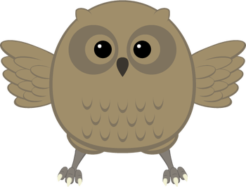
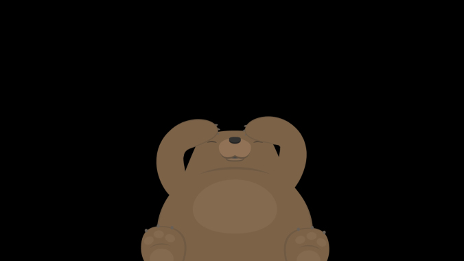
I had some characters already made up from an older project that I decided to reuse, which saved a lot of time.  The characters were created in Adobe Illustrator.  When I was creating these characters, my idea was to keep them simple and friendly-looking, with lots of rounded shapes and a limited color palette.  In addition to the owl and bear, I knew I wanted my piece to include a firefly, but I planned on creating that directly within After Effects.
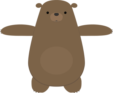
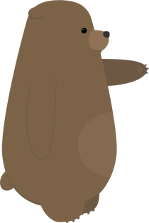
I also had a tree already created that I was able to use for this project.  I modified it slightly, by adding a hollow, and made a side view by changing the shape of the trunk and deleting some branches.
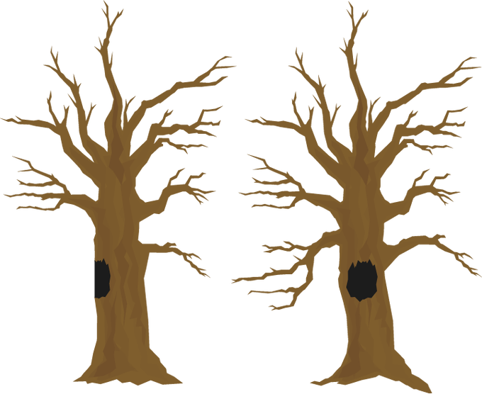
I often find the process of creating characters, sets, and props to be the most time-consuming part of the an animated project — even more than the animation itself.  For this reason, I’m always careful to keep anything I create so that I can potentially reuse it in the future.  I actually have a folder in my Google Drive full of old Illustrator and Photoshop files, so that I can pull things up quickly wherever I am.

Storyboards

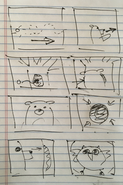
Before I sketched out my storyboards, I had the general idea of the piece figured out: a bear chases a firefly through the woods, the firefly goes into the hollow of a tree, and the bear is startled by an owl when he goes to investigate.  The bear freaks out, but the owl is friendly and the fireflies follow him out.  They all have a happy little moment together.

This is a very simple “story” – there is no dialog, the characters have very obvious motivations, and the actions are easy to understand.  This is what I think of as a “one gag” film – a short film in which only one thing happens.  In this case: a bear gets startled by a friendly owl.  I like projects like these because they force you to focus on the basic essentials of animation and storytelling.

I did some very quick and sloppy storyboards for this project.  This is such a helpful step, especially in terms of figuring out angles and perspectives.  While the storyboards are a great tool, they do not necessarily dictate what everything will look like in the final version.  The huge benefit of computer-based animation (like what we do in After Effects) is that it is still possible to make basic changes as you go.  In hand-drawn animation and stop-motion, this is much more difficult.
Animation

I imported the tree and the owl and bear puppets, then got the puppets rigged for animation.  For the firefly, I just created a little green circle and applied the Glow effect to it.  I then began animating them against a plain black background.

For this project, I skipped around a little, but mostly animated in order – shot one first, then shot two, and so on.  This is completely a personal preference, but working like this allows me to make sure that each shot flows nicely with the next one.  As I did the rough animation for each shot, I placed that shot’s composition into a larger composition so that I could see how the piece was coming together as a whole.  My general process is to start with basic movement, then add finer details, then refine the timing, and then to polish things up with final touches such as simulated camera movement or adding filters and effects.  For a few shots, I added a blur to either the background or a pre-composed puppet, to give the illusion of depth-of-field.
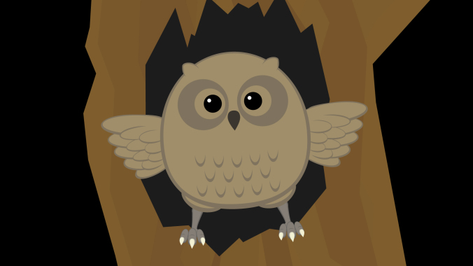
As I roughed out the animation, I made some alterations to places in the storyboard that I felt could be improved.  One of the first changes I made was to add more fireflies.  My storyboards only showed one, but adding a few more made the scenes they were in much more visually interesting.  The fireflies were animated using the “wiggle” expression to make them move randomly.  We haven’t covered expressions yet, but they essentially allow you to use formulas to animate different properties.  You could get the same result by using a wiggle animation preset.  You may remember animation presets from our discussion on animating text.  If you type “wiggle” into the search bar of the Effects & Presets panel, you should see several options appear.  Adding the “Wiggle – position” preset to a layer will allow you to define the frequency and amount of random movement in the Effect Controls panel.

By combining the wiggle with keyframed position animation, I was able to easily move the fireflies around the screen in a way that was organic and unpredictable.  Also, because the wiggle expression generates random movement, I could copy and paste the same firefly layer over and over again and get a unique result every time.

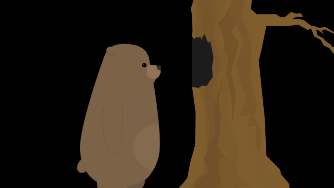
Another simple change I made was to adjust the shot of the bear peering into the tree from the side (as seen in the screen shot above).  In my original sketch, this was quite a close shot.  Looking at everything together, though, I decided that a wide shot would be more interesting.  Every shot prior to this one is fairly close, so going to a wider shot provided a some variety and allowed me to show the bear and the tree more fully.

There are a few shots in the piece in which either the bear or owl are seen from behind.  I didn’t create specific “rear view” puppets; instead, I simply masked out areas of my existing puppets in After Effects.  For example, to create the rear view of the bear, I just covered his face and “tummy patch” with a solid the same color as his fur.  If I were working on a longer project with several shots of a character from behind, it would probably be worth it to create a specific puppet.  I knew that these shots would be quick and simple to adjust for, however, so making the alterations inside After Effects was the easiest option.

Unexpected Challenges

Random problems arise all the time in animation – with luck, you are able to figure them out as you go.  On this project, I had occasional issues using the Puppet Pins tool to deform my bear character.  I wanted to bear to have a slightly “squishy” quality, but adding pins sometimes caused the puppet to deform in unexpected ways.  I did some experimentation and determined that this was likely caused by either the upscaling of the vector art, the parenting, or the order in which I was applying the pins.  In some cases, I reworked the animation to avoid these issues.  For others, I decided that the pins were simply causing more trouble than they were worth and decided not to use them.  After Effects is a complex program and it doesn’t always behave in the exact way we expect it to.  Being flexible enough to work through this is an important skill.
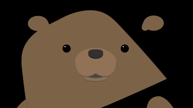
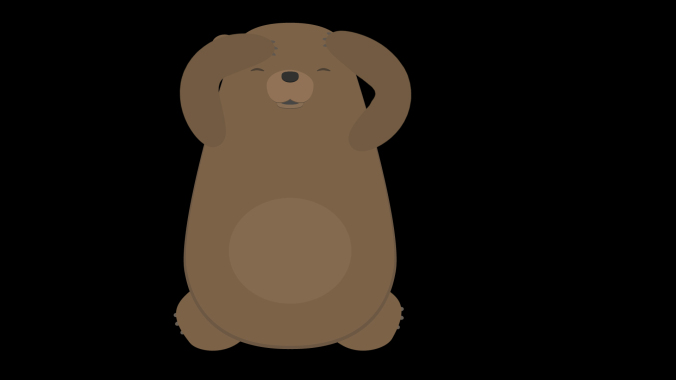
I mentioned previously that I was able to modify the owl and bear puppets directly within After Effects for shots in which they were seen from behind.  In the last two shots, I wanted the bear to be crouching on the ground, having fallen.  I had first planned to use my front view puppet of the bear for these shots, but I just couldn’t get a result that I was happy with.  I ultimately decided that it was worth creating an additional puppet of the bear on the ground.  This took some extra time, but gave me a result I liked much better.
Backgrounds

Since I was putting this project together quickly, I knew I didn’t have a lot of time to spend creating background images.  My initial plan was to create a sort of “greenish blur” that would suggest a woodsy backdrop.  It looked too abstract to me, though, so I decided I needed something with more detail.
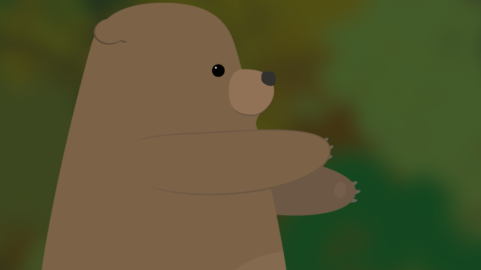
Next, I found a nice photo online using a Google search.  In the search tools are options for finding images that can be reused without violating copyright restrictions.  When I tried this image, I had the opposite problem – the background was too detailed for the simple character design.  I tried some blurs and filters to soften it a bit, but still wasn’t happy with the result.
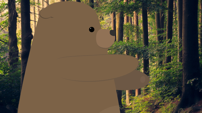
To make the image fit in better with the cartoon aesthetic I wanted, I imported it into Illustrator and created a vector image from it.  To do this, import the image and go to Object>Image Trace>Make.  There are several presets you can choose from, as well as more detailed options in the Image Trace panel.  Using Image Trace can time consuming (it may take a few minutes per image), but the result is a vector image with a sort of “posterized” look.  Once the image has been converted, it can be scaled up infinitely like other vector art.  This scaling gave me the flexibility to get all the background coverage I needed from this single image; I simply zoomed in to different parts of it for different shots.
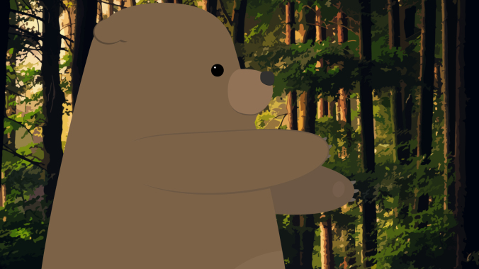
I think that the vector background fits in much better with the rest of the artwork.  If I had more time, however, I would probably create my background from scratch using simpler shapes.  This would give me the most flexibility and allow me to layer things in interesting ways.

Audio

I found ambient sounds, effects, and music on the YouTube Audio Library, findsounds.com, and Audio Blocks.  I had to do a little hunting around to get sound effects that I liked – for example, the first owl sound I downloaded was a pretty scratchy recording and it sounded out of place with the rest of the piece.

I tried several different sounds for the startled bear.  I actually found a few different recordings of bears, but the emotion wasn’t quite right.  The sound I eventually ended up using is actually a deer.  I went through a few different ambient noises as well – one was too windy, one had too many birds in the background, one had a stream in the background that sounded odd because we never see water in the short.

For music, I initially tried a few classical tracks, since that was my first idea of what might fit well.  Classical music felt too “serious,” though, so I kept trying new things.  Many music sites organize their tracks by genre and feel, so you can search for something like “humorous rock music” or “eerie classical.”  This makes wading through hundreds of pieces of music much easier.  In the end, I clicked on the track I used almost by chance.  I thought the title – “Root Bear” – sounded funny, like it might be a typo.  I gave it a listen and thought it would give the piece some silly charm, so I tried it out.

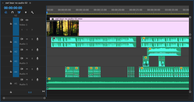
I actually added audio using Premiere Pro instead of After Effects, since I like that interface better for sound mixing.  Everything I did could have been done easily in After Effects, though.  In the image below, you can see that I edited the music track (A1) just a bit to make it fit the length of the piece.  The ambient sound (A5) goes underneath everything.  Tracks A2, A3, and A4 are all for different sound effects.
Final Thoughts

Given the time constraints I was working within, I’m fairly happy with how the piece turned out.  With more time, I would continue to refine the animation, adding more detail and perhaps working out the issues I had with the Puppet Pins effect.

I think that creating a custom background would add a lot to the piece — having a background that I could divide into layers would let me do some cool “parallax” effects.  It would also be cool to have some plants and trees in the foreground of certain shots to help give a feeling of depth.

I could also continue to add to the soundscape, try some lighting effects, or add texture to the entire piece using an adjustment layer.  At a certain point, you just need to move on to the next project, though.  What would you suggest?  What were the challenges you faced in your own work?  Before too long, we’ll be going through this process again for the final projects — hopefully, with some fun new abilities to use.

There’s no homework this week, but if you requested an extension on your mid-semester project, you can do a short writing assignment to make up the lost points.  Write a brief analysis (around a page) of an animated short film of your choosing.  Be sure to include a link to the film in your paper.

Categories
Projects

Mid-Semester Project: Unexpected Consequences

Alec

Justin

Sawyer

Ashley

Categories
Blog Posts

Animation Essays by kaptainkristian

Cartoons Deconstructed

Video essayist kaptainkristian dives into the finer points of all kinds of media (music, comics, children’s books, movies, and more), but I find his pieces on cartoons particularly insightful.  Check out his analyses of four very different animated series – FuturamaSouth Park, Batman: The Animated Series, and FLCL – and be sure to explore the other videos on his YouTube page if you like them.

Categories
Weekly Lessons

Week 9: Sound Advice

Appreciating Audio

We tend to think of film and television as primarily visual, but sound makes a huge impact on how we experience them.  In the world of animation, sound design takes on an especially important role, because you are (usually) starting with a  completely blank slate.  Sometimes, animated films take place in realities that are completely imagined.  It is often the job of the sound designer to make these worlds feel both fantastical and relatable.  The Danish short film below uses sound masterfully to create a reality that is bizarre, yet familiar.

We can break film sound down to a few basic categories: dialog, effects, music, and ambience.  Dialog is the sound of characters speaking.  Effects are the incidental sounds that things make: footsteps, creaking doors, squealing tires, and so on.  Music is generally one of the last audio elements added – although temporary music is quite often used in animatics.

Ambient sounds are persistent sounds that are often almost subconscious.  In an outdoor scene, the ambient sound might be the wind faintly rustling through trees.  In an indoor scene, the ambient sound might be the hum of an air conditioner.  Ambient sound is sometimes referred to as “room tone.”  Every space has its own subtle sound – we are almost never in a completely soundless environment.  Ambient sounds are different from sound effects in that ambience is tonal instead of narrative; instead of telling part of the story, it helps set the mood.
When you are adding sound to your own projects, I would encourage you to never have complete silence.  There should always be ambient sound or music or something.  It’s actually very jarring to suddenly have all audio cut out.  Unless that is the specific effect you are going for, include some sort of sound at all times.

Audio in After Effects

The audio tools in After Effects are pretty basic, but they are enough to do a fairly simple audio mix with.  You can add keyframes to the levels on any layer with audio, which lets you fade sounds in and out or adjust the overall volume.  There are also a handful of audio effects that can be applied.  These can be used to do things like add reverb or tweak the bass and treble of a track.  Adding the “Stereo Mixer” effect to a layer will allow you to pan audio to the left or right channels.  Remember that you can mute tracks by unchecking the box with a speaker icon in the timeline.

For the projects we are working on in this class, these tools should be more than sufficient.  If you want to do more advanced audio work, however, I would recommend using a different program.  Audacity is free to download and can be used to create sophisticated multi-track mixes.  If you subscribe to Adobe’s Creative Cloud service, you have access to Audition, which has powerful tools for filtering, modifying, and repairing audio.  Many video editing tools also have solid audio capabilities, so if you are familiar with Premiere Pro or Final Cut Pro, those are good options as well.  On the really advanced end of the spectrum are dedicated and complex programs such as Avid’s Pro Tools.

Whatever software you end up using, the most important aspect of sound design is to be conscious of the ways that it alters your film.  If you want to create a sense of unease or dread in your short film, try using some dark, droning ambient noise.  If you want to make a scene bright and happy, reflect that with your music choices.  To make your film seem more exaggerated and “cartoony,” you can add obvious sound effects to your character’s movements – such as a “whoosh” when they turn their head.  For a more realistic approach, be more subtle.  The options are endless.

Remember that there is a section called RESOURCES linked in the top menu of this website.  It contains links to pages where you can download royalty-free music, ambience, and sound effects.

Extra Special Effects

There are a lot of effects built into After Effects and countless more can be added using third-party plugins and scripts.  While there are far too many to discuss them all individually, I thought it might be useful to take a look at a few of them more closely.  Here are a few “must know” effects – and a couple that are just fun to play with.

Curves (Color Correction)

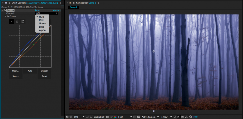
Curves is a simple, but powerful tool that you may already be familiar with if you have experience with photo editing or color correction.  Curves gives you control over the color information in an image or video by letting you adjust the red, green, blue, and alpha channels, as well as the overall saturation and brightness.  You simply choose the channel you want to adjust, then click and drag points on the appropriate line.  A small adjustment goes a long way with this effect – dragging a line all the way to the top or bottom of the graph will probably give you pretty bizarre results.  If you want a simpler method of color correcting something, there are also effects for Brightness & Contrast and Hue/Saturation in the Color Correction section – but I think Curves gives the most control.

Glow (Stylize)

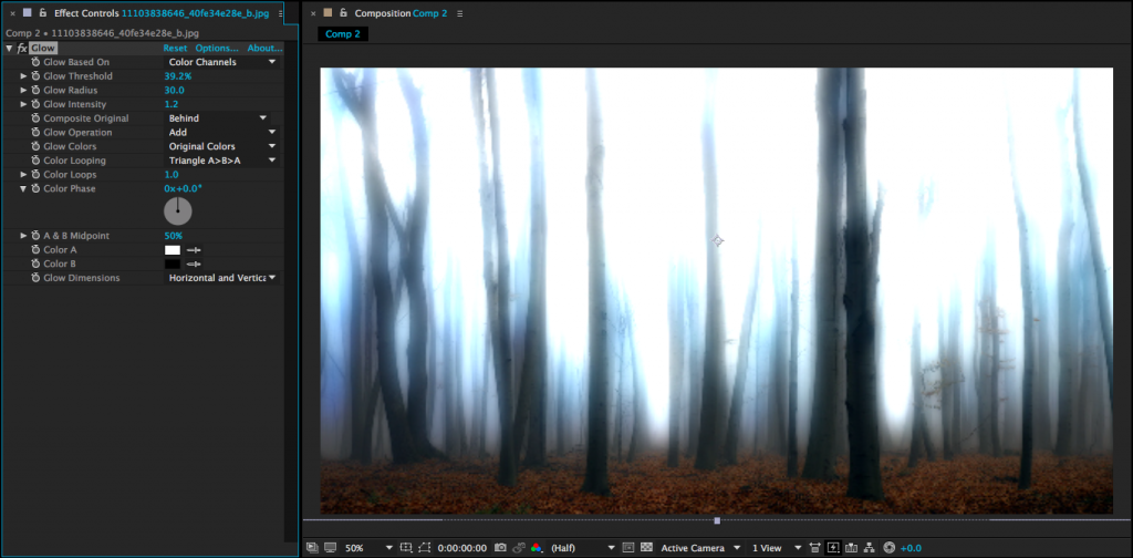
This is an effect that’s easy to overuse, because it often just makes things look cooler.  Adding Glow produces a soft aura around the bright areas of an image.  The “Glow Threshold” determines how bright something needs to be for the glow to appear – so to make more of the image glow, you actually set the threshold to a lower percentage.  You can also adjust the radius, intensity, and color of the glow to dial in the exact look you are going for.  To give your entire scene a hazy glow, try creating an adjustment layer and adding Glow to it – just be aware that it might slow down your render time.

Gradient Ramp and Fill (Generate)

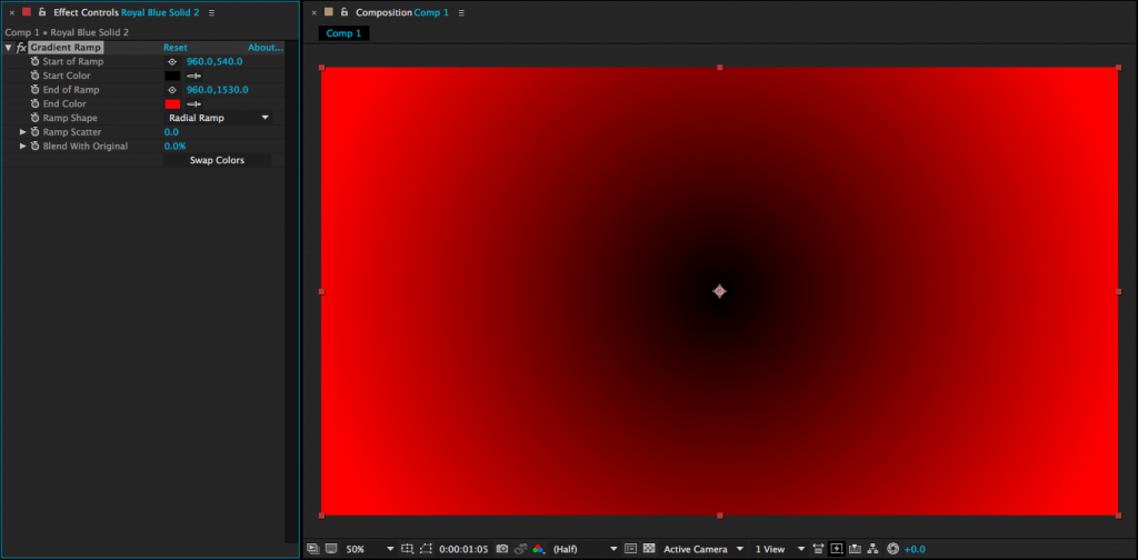
Both Fill and Gradient Ramp are simple effects that get used a lot.  Adding Fill to any layer will cover that layer with the solid color of your choice.  So, if you wanted to create a silhouette version of a character you were animating, you could pre-compose the character’s layers and apply a dark grey Fill to the resulting composition.  Gradient Ramp does the same thing, but uses either a linear or radial two-color gradient instead of a solid color.  You can use Gradient Ramp to quickly add a bit of visual interest to an otherwise plain background.  Changing the start and end points of the Gradient Ramp affects where one color stops and another begins.

Fractal Noise (Noise & Grain)

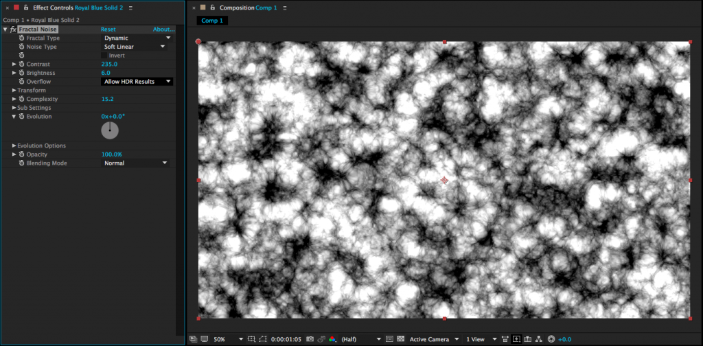
Much like the Gradient Ramp and Fill effects discussed above, adding Fractal Noise to a layer covers that layer completely.  However, instead of a simple color or gradient, Fractal Noise creates a complex black and white noise pattern on the layer.  Changing the “Fractal Type” will allow you to generate a variety of patterns  – some are blocky, some look like smoke, some look like television static.  You can adjust the contrast, scale, and more, but the real magic of Fractal Noise comes from animating the “Evolution” property of the effect.  This causes the noise to change dynamically, which gives really interesting results.  Fractal Noise is a great effect to use when you want to give a project some texture.  Create a solid on top of your composition, add the effect, then change the transfer mode and/or opacity of the layer so that it is barely visible – the result can be really striking.  Fractal Noise has tons of other potential uses as well; you could use it to simulate smoke or water, create a unique background, or combine it with other effects.

Gaussian Blur, Fast Blur, and Camera Lens Blur (Blur & Sharpen)

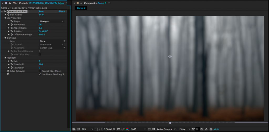
There are several blurring effects in After Effects, but I use these three the most.  Gaussian Blur and Fast Blur are basically interchangeable – they are simple blur filters that don’t take too long to render.  For a long time, Fast Blur was my go-to because it rendered (imagine this) faster, but recent versions of After Effects have improved the speed of Gaussian Blur and moved Fast Blur to the Obsolete category of effects.  It still works well, though.  For the absolute best results, however, I would recommend Camera Lens Blur.  This effect does a much better job of recreating the kind of blur you get from an out-of-focus camera lens; points of light, for example, are rendered more realistically using Camera Lens Blur than Gaussian Blur.  The downside of Camera Lens Blur is that it is much more processor-intensive and will slow your computer down more than the other options.  One thing to note with all of the blurs is that the edges of the layer you are blurring will soften along with the rest of the image unless you check the “Repeat Edge Pixels” option.

Offset (Distort)

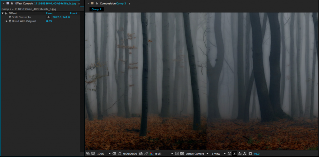
Offset is a very cool effect that can be used for things like endlessly looping backgrounds.  When you apply it to a layer, you can keyframe to “Shift Center To” property to scroll through endless copies of that layer.  If you do this to a layer that is seamless on either the left and right or top and bottom, you’ll have a nice infinite loop.  This is a great way to do something like clouds floating by continuously in the background of your shot.

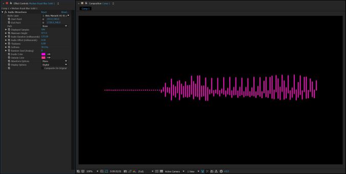
Audio Waveform (Generate)

This is a neat effect for quickly and easily creating an audio waveform.  It should be applied to a solid or other visual layer – not the audio layer itself.  Once the effect is applied, you can choose the appropriate audio layer from the first dropdown menu.  There are a few different styles to choose from and define the color, size, and position of the waveform.  If the waveform is too small or too large, change the “Maximum Height” property.

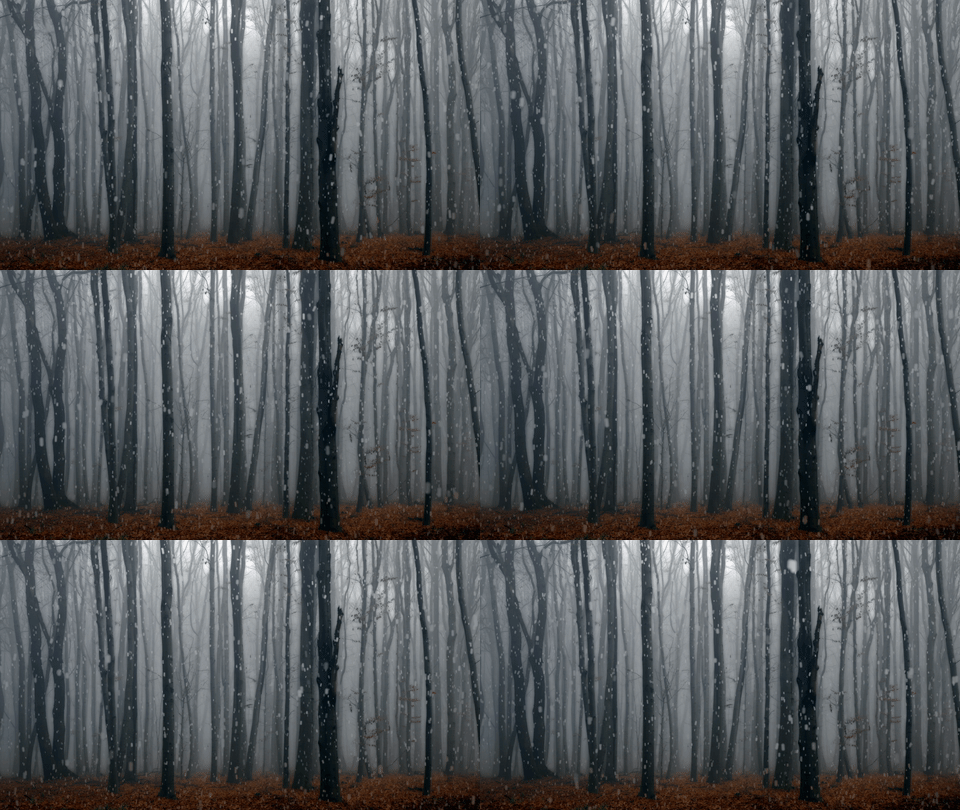
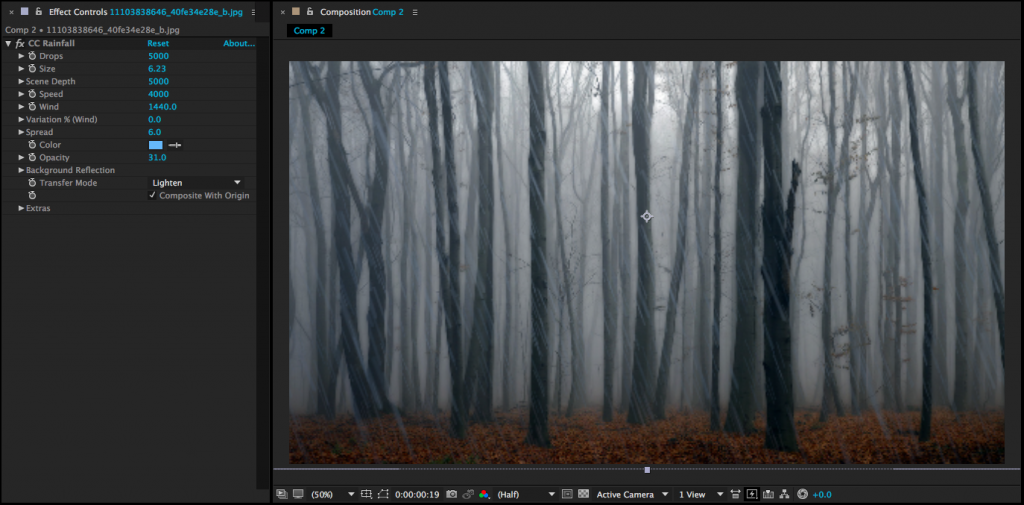
CC Snowfall and CC Rainfall (Simulation)

CC Snowfall and CC Rainfall can be used to quickly add “weather” to a scene.  You can dial in settings like the size, opacity, color, and density of the effects as well as playing with forces like wind and random variation.  Both effects look pretty good at their default settings, though.  Note that by default the effects are composited on top of a layer, so you should either pre-compose your scene and then add the effect to the resulting composition or apply the effect to a solid and uncheck the “Composite With Original” box.

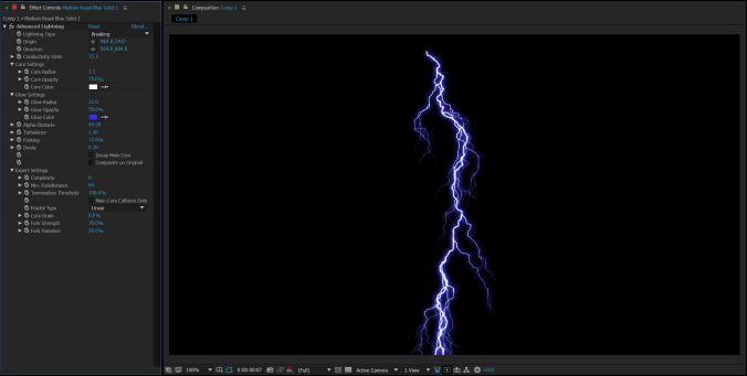
Advanced Lightning (Generate)

Rounding out the weather effects is Advanced Lightning, which is just like regular lightning, but with a way cooler name.  In all seriousness, After Effects does a pretty solid job of simulating lighting.  There are several different types to choose from and you can define the size, color, and how many “forks” the bolt has.  If you want the lightning to crackle, keyframe the “Conductivity State.”

Midterm Projects

The mid-semester projects are due in one week, on March 29.  Send me your finished projects before class next Wednesday – you can review the details of the project at this link.  I’m looking forward to seeing what you all come up with!

Categories
Weekly Lessons

Quick Review: Previewing Work

Buffering…

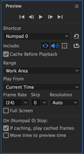
There are actually several different ways of previewing the project you are working on in After Effects.  The Preview window contains lots of options, which may be hidden until you expand the panel to its full dimensions.  By default, there are three basic methods of previewing your composition, each of which can be further customized.  Note that these may change slightly from version to version of After Effects, but they can always be customized in the Preview panel.

Pressing the space bar will preview your composition without cacheing the frames first.  This means that After Effects will attempt to play what you are working on in real time, as best it can.  If you have a fast computer or a simple composition, this may work fine.  However, your playback may start to slow down or stutter.

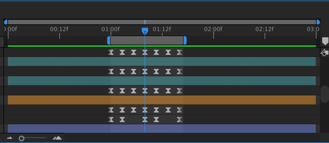
Pressing the zero key on your number pad will cache the frames in your composition before playing them back.  This is called a RAM preview – essentially, After Effects is temporarily rendering your composition before playing it back.  You may have noticed a green line near the top of the timeline panel.  Areas that are green have been cached and should play back relatively smoothly.  When you press the zero key, that green line will gradually fill up.  When it fills the timeline – or when you press zero again – the preview will play.  Note that you must press the zero key on the number pad for a RAM preview – not the zero key in the numbers along the top of the keyboard.

The last type of preview is an audio preview, which is fairly self-explanatory.  You activate an audio preview by pressing the period key on the number pad (again, it must be the one on the number pad).  This will play only the audio in a composition – no video.  When doing an audio preview, you may find it helpful to see a waveform of the audio being played.  To do this, simply highlight a layer in the timeline with audio and press twice quickly.

One nice thing about the bevy of preview options in After Effects is that you can really customize how they operate.  In the preview panel, you’ll find options for resolution, sound, looping, and much more.  You can choose whether the preview plays from the beginning of the composition or from wherever the playhead is.  If you always want your preview to play in full screen mode, there is an option for that.  Because previewing footage in After Effects is so intensive, it’s extremely helpful to have these options.