Curious about how the brain transforms still images into movement? Check out the following videos from TED-Ed.
Month: January 2017
Week 2: Becoming an Animator
The Building Blocks of Animation
Last week, we talked about how and why animation works in terms of cartoon representation; how simplified “iconic” images possess a unique ability to relate to the audience and amplify meaning. However, that discussion could be applied to any visual art – drawing, painting, sculpture, etc. Let’s move on to the unique properties of time-based media.
We know that animation is made up of deliberately composed frames, but how do those frames end up on the screen? There are currently three basic techniques used for “capturing” animation, with a few outliers and overlaps.
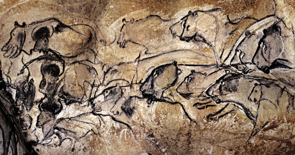
The first technique is frame-by-frame animation. In frame-by-frame animation, an animator creates each frame individually, in order. Hand-drawn or cel-based animation is a done frame-by-frame, as is stop-motion. Since each frame is being created individually, frame-rate is a major consideration for frame-by-frame work. Animation being done at 24 frames-per-second requires twice as many frames to be created as animation done at 12 frames-per-second.
 The most obvious examples of frame-by-frame animation are the “classic” animated films done before the advent of computer animation. However, frame-by-frame animation actually dates back to before the invention of film to simple toys like the zoetrope – and, possibly, to the dawn of art itself.

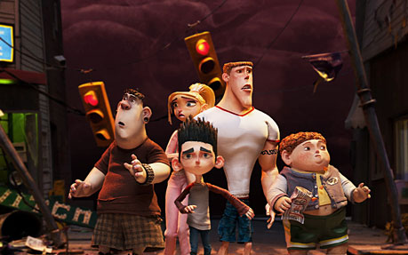
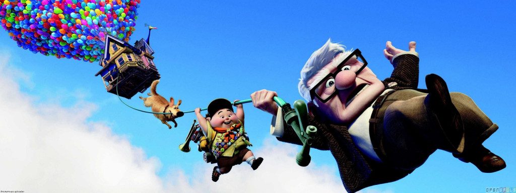
The second technique is keyframe animation, which is an evolution of the frame-by-frame technique. In keyframe animation, an animator defines the “key” moments in a sequence. When the project is computer-based, software then fills in the blanks. When the project is hand-drawn, the original animator goes back and fills in the blanks after the key poses are set, or hands the work off to another animator to fill in. The animators who fill in the blanks are called “in-betweeners” and they are essentially acting as human animation software.
Keyframe animation and frame-by-frame animation might seem distinct, but they are actually closely related and are often used within the same sequences. A traditional animator might start with keyframes, then fill in the in-between frames, then add additional details frame-by-frame. An animator using software for keyframe animation (like After Effects) might go through a similar process, beginning with broad keyframed movements, then tweaking individual frames one by one. Keyframing might seem like a huge time savings – and it can be! – but even when an animator is only setting the start and end points, there may be dozens of different actions happening in a sequence simultaneously. Three-dimensional computer-animated films (think Pixar and recent Disney animated films) are generally done using keyframes. One technique where keyframes can’t be used is stop-motion; because stop-motion animators are physically moving puppets, they can’t jump back and forth in a sequence to define keyframes.
The third technique is motion capture. This is the newest animation technique and the one that requires the most specialized equipment and software. In motion capture, an actor wears a special suit (or make up, for facial motion capture) covered with reflective dots that can be tracked by software. As the actor moves, a camera interprets the movement of the dots and applies them to the movement of an animated character. Sometimes this is done after the fact and sometimes it is done instantaneously. It is now fairly common to see an actor in a motion capture suite on set interacting with actors in costume.
Because motion capture is created using “real world” movement, it can be used to create animation that is realistic and subtle. Motion capture is often used in the special effects industry, where believability is of the utmost importance. It is also commonly used to create animation for video games.
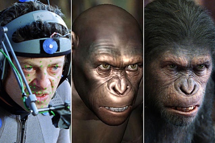
The biggest benefits of motion capture are speed, realism, and the ability to improvise. A motion capture actor can collaborate in the animation process – keyframe and frame-by-frame techniques rely solely on the animator. The downside of motion capture is that it can introduce too much realism – or, perhaps, the wrong kind of realism – into the animation process. When we watch something that we know is animated, we accept (and even anticipate) a certain level of exaggeration and a certain level of simplification. This relates back to our discussion of “iconic” imagery. Animation that looks nearly real, but seems just slightly “off” can be incredibly distracting. The industry term for this phenomenon is the “uncanny valley.” Animated films like The Polar Express have been criticized for looking too real to be cartoons and too cartoony to be real. The uncanny valley refers to this disconnect with regard to both visual representation and movement.
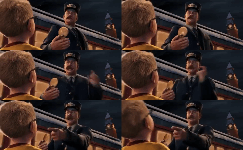
There are also some techniques that defy easy categorization. Marionette or puppet-based films are not truly animated, but they fit the definition of iconic cartoon representation. Rotoscoping, a technique wherein live-action photography is covered with cartoon art, falls somewhere motion capture and the other techniques. There are also still-image-based films (sometimes called “diaporamas”) that are composed of frames in sequence, but do not give the illusion of movement.

The 12 Principles
If the uncanny valley is a problem because we don’t expect animated things to move in a completely realistic way, how should animated objects move? What makes animation effective? The best guide probably comes from two former Disney animators named Ollie Johnston and Frank Thomas in their book Illusion of Life. Johnston and Thomas defined twelve “basic principles” that animators should master. They are as follows:
- Squash and Stretch – The idea that the shape of objects and characters is flexible and determined by their movement. The classic example is of a rubber ball elongating as it falls and squishing down as it hits the ground.
- Anticipation – This is a small action that precedes a larger one, such as when you duck down slightly before jumping.
- Staging – This deals with the way a scene is arranged. Ideally, it should direct the viewer’s attention in a clear way.
- Straight Ahead Action andPose To Pose – Essentially, this is the difference between frame-by-frame (straight ahead) and keyframe (pose to pose) animation.
- Follow Through and Overlapping Action – These two techniques help animation seem more natural. In follow through, moving objects tend to keep moving past their destination because of inertia; for example, your arm keeps swinging after you throw a baseball. Overlapping action is the movement of multiple objects or body parts simultaneously, but at different rhythms or speeds.
- Slow In and Slow Out – Generally, objects in motion don’t move at a steady rate. Instead, they accelerate or decelerate depending on a number of factors. Slow in and slow out can tell the viewer a lot about an object’s weight, mass, and speed.
- Arc – Things very rarely move in perfectly straight lines – most action follows an arc trajectory. A thrown ball will move in a rounder or flatter arc depending on its speed. Walking is composed of small arcs from step to step.
- Secondary Action – This is a smaller action added by the animator to emphasize a bigger one. Things like facial expressions and hand gestures are often used as secondary actions.
- Timing – In its simplest terms, timing describes how long animated actions take to occur. Johnston and Thomas are specifically referring to the number of frames an action takes and how manipulating that number can change the meaning of that action.
- Exaggeration – The amount of exaggeration in animation is largely determined by the level of realism in the work. Often, exaggeration is used for comedic effect, but a certain level of exaggeration is usually expected.
- Solid Drawing – In two-dimensional animation, the animator should consider how the character or object would exist in three-dimensional space. This helps give things mass, weight, and balance. Without solid drawing, things tend to appear flat and floaty.
- Appeal – This relates to character design. Animated characters should be pleasing to look at. This doesn’t necessarily mean that they must by physically attractive, but they should be interesting to the eye. Exaggerating proportions and playing with shape is a good way to do this.
For an excellent and concise explanation of each of the twelve basic principles, check out Alan Becker’s series on YouTube.
Keep in mind that Johnston and Thomas’s principles are just that – guiding principles, not hard-and-fast rules. Squash and stretch or exaggeration can be used to varying degrees to make a piece more realistic or more cartoony. The principle of solid drawing could be ignored to make a piece deliberately surreal. Whether you follow the principles closely or purposely break them, the most important thing is that you understand and consider them as you move forward with your own animated projects.
Editing Animation
If you have any understanding of the production process, you know that the editor of a film has a tremendous role in shaping tone, pacing, and narrative. How does this apply to animation? While live-action films are generally cut from dozens (or hundreds) of hours of footage, the animation process doesn’t produce much, if any, “extra” footage. So what is the role of an editor?
As discussed in the following short documentary from The Royal Ocean Film Society, the editor on an animated project is actually a collaborator in the filmmaking process much earlier than a live-action editor is. Because animation is, by its very nature, tedious and time-consuming, you absolutely don’t want to waste time and money by creating shots that you aren’t going to use. On a live set, changing camera lenses, adjusting blocking, or trying something new with the lighting is relatively simple. When in doubt, you can film something multiple ways and then choose the best approach in post-production. Animators don’t usually have that luxury – they need to know the best approach before they start the animation process.
Even on short animated projects, planning is of the utmost importance. I generally start by writing a general outline, then some very crude sketches. From there, I draw more detailed storyboards, which I refine until I’m happy with the flow of the piece. Depending on the complexity of the sequence you’re working on, you may want to go a step further and create an animated version of your storyboards (known as an “animatic”). You should only begin animating once you have a clear plan and know that the shots will work together.
Assignment 2: Start Animating
For your first animation assignment, I’d like you to create something without the use of a computer. It can be done using stop-motion puppetry, paper cut-outs, collage, drawing on paper, drawing with chalk or a white board, or another “hands-on” technique. Create at least two seconds of animation at a minimum average of 12 frames-per-second (in other words, you must create at least 24 frames). Your animation should show an action and a reaction. Plan it out in advance and, as you work, keep the basic principles of animation in mind.
The easiest way to capture your animation is probably using your phone. There are a number of free apps for creating animation; I’d suggest Stop Motion Studio, which is available for both Android and iPhone. Stop Motion Studio allows you to take photos within the app and choose the frame rate at which they play back. If you’re starting with drawn images on paper, complete your artwork first, then take photos of the pages using the app.
One challenge is going to be keeping your phone steady as you work. You may want to consider securing your phone to a stable surface using rubber bands, tape, or clay. Even just leaning your phone up against something can help a lot. You will probably have to do some problem-solving and improvising to make things work – have fun and get creative!
Animating frame-by-frame like this is time-consuming and difficult to master. Don’t get discouraged! Seeing animation that you’ve created with your own hands come to life is incredibly rewarding. The goal here is to get a better understanding of things like motion, speed, and timing.
When your animation is finished, export the video and email it to me at dan014@bucknell.edu. If your file happens to be too big to email, drop it in your Google Drive storage and send me a link. Happy animating!
Project 1: Watch Something Cool
Alec: Dannyboy
Sawyer: Samurai Jack – The Birth of Evil Part 1
https://www.youtube.com/watch?v=bICFZ28pXAw
Veronica: Mental Images
Hugh: Feast
Justin: Slow Wave
Bri: BIG BANG BIG BOOM and The Maker
The Japanese Animation Masters
There are few animation studios in the world more beloved than Studio Ghibli. Some refer to Ghibli as the “Japanese Disney” – and while that comparison is problematic in many ways, it does speak to the incredible cultural impact that the studio has made in its native country. Led by legendary Hayao Miyazaki, Ghibli has created some of the best-loved works in the history of the medium, including Spirited Away, My Neighbor Totoro, Ponyo, and Princess Mononoke. The following video essays look at the remarkable work of the studio’s founders and their approach to creating incredible animated worlds.
https://www.youtube.com/watch?v=52raDbtNpa4
If you are interested in learning more about Studio Ghibli and how it operates, I would highly recommend the lovely 2013 documentary The Kingdom of Dreams and Madness. If you’re interested in Miyazaki’s unique use of female protagonists, I’ve actually written about the subject – you can download my thesis Goddesses of Water & Sky on Kindle or as a free PDF.
Week 1: Animation Matters
Welcome!
Welcome to the Spring 2017 edition of the Film/Media Studies Production Practicum! This course is focused on the analysis and creation of animation. For analysis, we’ll be looking at a variety of pieces from throughout the history of the medium, as well as reviewing and critiquing the work produced in this class. For creation, we will primarily be using Adobe After Effects, a powerful and versatile program. We will also use Adobe Photoshop, Adobe Illustrator, and other applications throughout the semester.
There are a few odds and ends we need to take care of before we can really dive into the exciting world of animation. First, you should make sure that you have this class listed as .5 credit on your schedule. It defaults to .25 credit, so you may need to change it manually. If you have trouble with this, please contact Melissa Weber at maweber@bucknell.edu.
I’ll set up access to the course Moodle page for everyone soon, but I generally only use Moodle for grading. For weekly lessons, we’ll be using this blog: fmspracticumspring2017.blogs.bucknell.edu. This site will contain assignment details, lectures, work created in class, fun videos to check out, and lots more. It will essentially be your textbook for the course, so be sure to keep it handy!
The only material required for this class is an external hard drive for saving your work. I would suggest an external hard drive over a small thumb drive because they are faster and have higher storage capacity. If you don’t have a hard drive already, I’d suggest getting a USB 3.0 drive with at least 500GB of storage. You can pick up 1TB drives from the Bertrand Library Equipment Services for around $60. There are also lots of options at Amazon, Target, Best Buy, etc.. Both the Digital Video Editing Lab in the library and the Marts video studio have networked storage systems, but they are (unfortunately) different networked storage systems and such options are not always completely reliable. Working of an external hard drive allows you to be mobile. Of course, I would also suggest backing up important work to a different hard drive, just to be safe.
Before we dive into the creation of animation, though, I want to spend a little time on the ideas behind animation as a medium.
Does Animation Matter?
That’s a rhetorical question; of course animation matters. I considered lecturing about the tragic misunderstanding surrounding animation; how it is unfairly perceived as little more than children’s entertainment. But I honestly don’t really see the point. While the cultural stigmas and expectations surrounding animation are worth considering, they are also pretty obvious. We all know that animation isn’t just for kids. I don’t think anyone taking this class needs to be convinced of the medium’s merit.
Instead, let’s consider some of the more subtle qualities of animation. I think that the following video essays –each focused on very different animators – are both entertaining and insightful.
The Language of Symbols
Now that we’ve absorbed some thoughts on how different animators approach the medium, let’s spend just a little time talking about why animation works at all. If you step back and consider what happens when you watch an animated film, it’s sort of miraculous that you can make sense of it at all. Not just because of the inherent strangeness of watching a film or video – although the alchemy of thousands of images coming to life is astounding in its own right – but because animation generally uses symbolic (or “iconic”) visual representation in a very interesting way.
What do you see below?
: )
A face? A human face tied to a specific emotion? Why would something so simple call to mind something as complex as a human being experiencing the concept of happiness? This is the sort of question that pertains to all visual art, of course, but something about the illusion of life in animation makes it seem especially relevant.
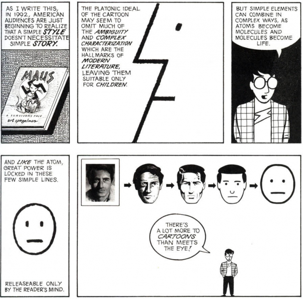
I’m going to borrow pretty heavily from Scott McCloud and his excellent Understanding Comics for this discussion. McCloud is obviously focused on comics, but a lot of what he writes about is applicable to animation as well. In his chapter “The Vocabulary of Comics,” McCloud spends a lot of time talking about what he calls icons and how the level of visual realism they carry imbues them with different qualities.
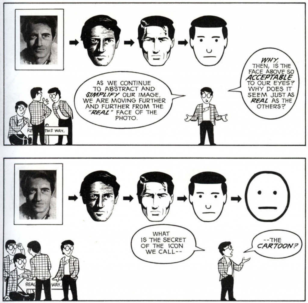
McCloud argues that cartoon icons – simplified visual representations of real-world things – contain a unique power. For one, the generalization present in cartoon representation allows the viewer to project themselves into the character. McCloud ties this to the fascination that children have with animated characters.
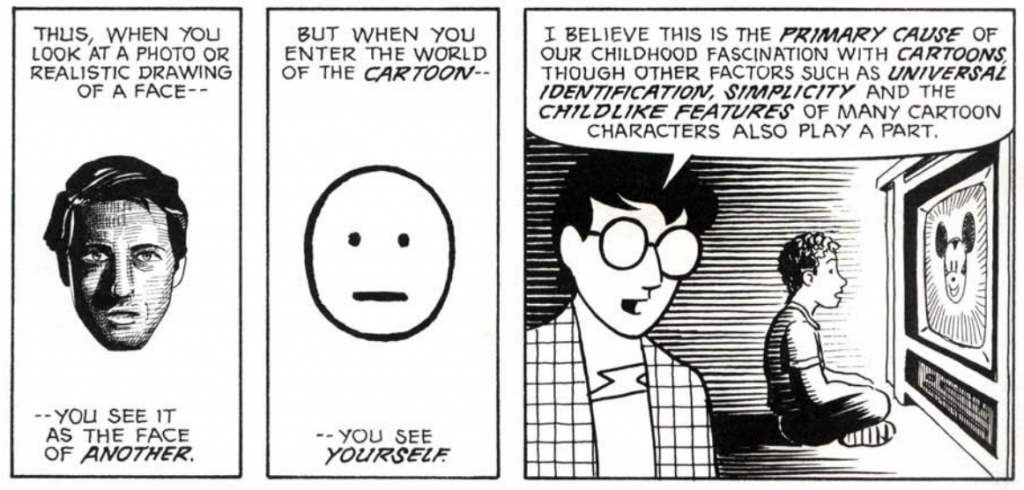
Another power of cartoon representation lies in its ability to magnify certain qualities of the character or thing being shown. Because cartoons use fewer elements (details, shading, realistic proportions, etc.), the elements that are present become incredibly potent.
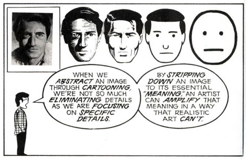
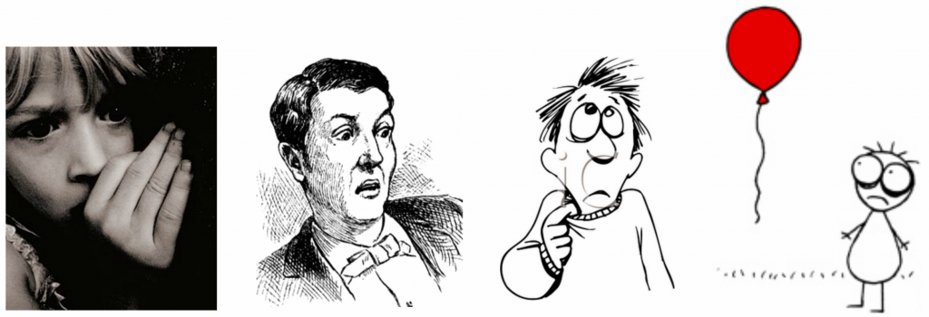
In the following images, the idea of nervousness or fear is shown with decreasing realism. While the photograph is potent, it’s also complex and specific. The stick figure (which is from Don Hertzfeldt’s Billy’s Balloon) conveys a similar emotion with far greater economy – and, potentially, more power. Just as an exercise, consider this: the last time a movie made you really emotional, was it live-action or animated?
Assignment 1: Watch Something Cool
I think that it’s really important to watch lots of animation if you’re going to create animation. Below is a piece from one of my absolute favorite animators, Don Hertzfeldt.
Hertzfeld’s work is funny, tragic, and absurd. “Everything Will Be OK” is the first of three short films centered on the character Bill. These films blend photographic elements with meticulously hand-drawn – and highly “iconic” – characters. Because the figures are drawn so simply, each movement and each line carries tremendous weight. Things like the way characters move their hands, their posture, or the tiny lines on their faces imbue them with life in a remarkable way. Hertzfeldt also uses music and sound design in very interesting ways – to highlight the emotional quality of a scene, draw attention to certain details, or surprise the viewer.
For your first assignment, I’d like you to watch an animated short film. There are lots of channels dedicated to animation on YouTube and Vimeo; you could also try a site like Cartoon Hangover, Cartoon Brew, or Short of the Week. There are endless options, just find something interesting. It can be any length, just keep it under 20 minutes. It must be available to watch (legally) online.
Once you’ve found your short film, write a few sentences about why you think it’s interesting. How does the animator use imagery and sound? Are any clever editing techniques being used? Are the characters iconic or more realistic? Just write up a brief analysis of the film and email it to me (dan014@bucknell.edu) with a link to the film itself. Send them to me by next Tuesday night at the latest, so that I can review the films and post them online before class.